Friday, August 7, 2009

Tuesday, June 16, 2009
Fight Club, Ikea and Heavy Rain
Heavy Rain lead designer (?) David Cage on the UI of the game:
I was always a little bit frustrated with the interface because I thought it was a little bit old fashioned. This idea of having a 3D environment with glass on the top with symbols, and when you want to know how to interact with it you need to look at the symbols, look at what you need to do. "OK. I need to do this in order to interact with that."
It was silly in a way. So I wanted to find a solution. It is funny because you were talking about inspiration, to be honest with you, it came from Fight Club. There is this scene in Fight Club with the IKEA furniture and stuff, and everyone was so amazed when they saw that movie and said, "Wow, that is so cool!"
We wanted to find a solution. I thought again about Fight Club and I thought that this could be the solution. We wanted to find something that would be clear but that would not interfere with the environment. So that was difficult. We made many tests, but we are quite happy with the results.
http://www.joystiq.com/2009/05/27/interview-david-cage-of-quantic-dream-and-heavy-rain/
I was always a little bit frustrated with the interface because I thought it was a little bit old fashioned. This idea of having a 3D environment with glass on the top with symbols, and when you want to know how to interact with it you need to look at the symbols, look at what you need to do. "OK. I need to do this in order to interact with that."
It was silly in a way. So I wanted to find a solution. It is funny because you were talking about inspiration, to be honest with you, it came from Fight Club. There is this scene in Fight Club with the IKEA furniture and stuff, and everyone was so amazed when they saw that movie and said, "Wow, that is so cool!"
We wanted to find a solution. I thought again about Fight Club and I thought that this could be the solution. We wanted to find something that would be clear but that would not interfere with the environment. So that was difficult. We made many tests, but we are quite happy with the results.
http://www.joystiq.com/2009/05/27/interview-david-cage-of-quantic-dream-and-heavy-rain/
Wednesday, June 3, 2009
Week Summary: 18/5 - 22/5 + 25/5 - 29/5
After two weeks absence, it's time for a return of the week review! The last two weeks have been quite busy. We've finally finished the last user test, and a first version analysis of the results can be found here in the blog. Last week was spent in stockholm taking part in some user tests at DICE and interviewing various employees at the company about the role of the UI designer, done in order to shape our guidelines in the best way possible. This was quite rewarding for us.
This week, we're looking at the guidelines and we've already got a rough outline for them. On friday we will meet Staffan to discuss this and the report. Looking forward, the coming weeks will be quite documentation-heavy, which might result in less activity blog-wise than before.
Over and out.
This week, we're looking at the guidelines and we've already got a rough outline for them. On friday we will meet Staffan to discuss this and the report. Looking forward, the coming weeks will be quite documentation-heavy, which might result in less activity blog-wise than before.
Over and out.
Splinter Cell takes the UI into the 3D geometry
Time for another upcoming game that explores the possibilities of putting the UI inside the game world. Tom Clancy's Splinter Cell: Convinction (phew) briefs the player through the missions and partly tells the narrative by projecting text and moving pictures onto not only walls and floors, but also on the characters if they happen to be in the way (like if a person would stand between a projector and it's surface).


Yet another interesting design choice and quite artsy, with the projector effect breaking the wall between what is diegetic and what is not. I'm not sure if I dig it from an immersion point of view though. Gameplay video can be found at http://www.gamersyde.com/stream_11254_en.html
Update: Interview with the creative director, quite interesting as he, among other things, uses the term "breaking the fourth wall".
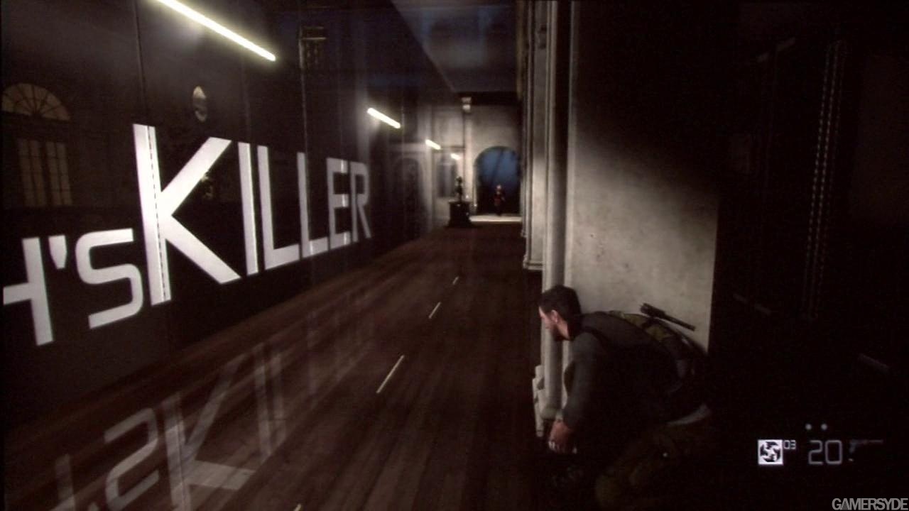
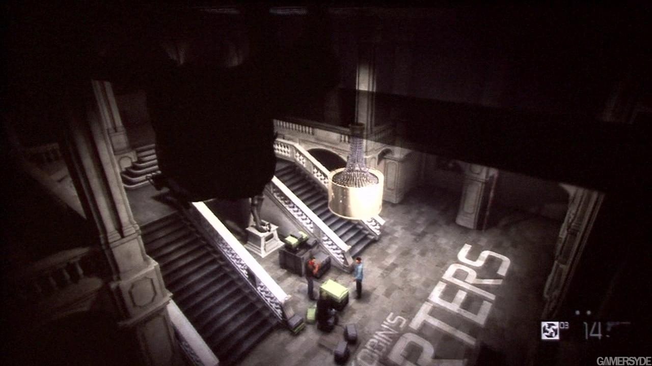
Yet another interesting design choice and quite artsy, with the projector effect breaking the wall between what is diegetic and what is not. I'm not sure if I dig it from an immersion point of view though. Gameplay video can be found at http://www.gamersyde.com/stream_11254_en.html
Update: Interview with the creative director, quite interesting as he, among other things, uses the term "breaking the fourth wall".
Tuesday, June 2, 2009
Features, Affordances and Signifiers
I'v read up on some HCI stuff and it seem like the general concensus in the HIC community is that:
A Feature is something that the application/game allows you to do. Let's say that the feature is that you can blow up some (but not all) barrels in a game, causing damage to nearby enemies.

An Affordance is the way you go about achieving/triggering the feature. In this case this is done by hitting the barrel with one of the weapons at your disposal. This affordance is both consistent with reality (this is how volotile cemicals actually behave under fire) and an often seen feature in action movies and games.
A Signifier is the way in which the player perceives that the feature/affordance exists. in the case of the explodable barrel this would be the red markings and the "FLAMMABLE" label. The signifier is what helps player destinguish between flammable and non-flammable barrels in the world.
A Feature is something that the application/game allows you to do. Let's say that the feature is that you can blow up some (but not all) barrels in a game, causing damage to nearby enemies.
An Affordance is the way you go about achieving/triggering the feature. In this case this is done by hitting the barrel with one of the weapons at your disposal. This affordance is both consistent with reality (this is how volotile cemicals actually behave under fire) and an often seen feature in action movies and games.
A Signifier is the way in which the player perceives that the feature/affordance exists. in the case of the explodable barrel this would be the red markings and the "FLAMMABLE" label. The signifier is what helps player destinguish between flammable and non-flammable barrels in the world.
Thursday, May 28, 2009
Spatial HUD in Heavy Rain
Upcoming game Heavy Rain features a UI completely freed from a conventional HUD, with occasional button prompts in an overlay manner, yet in the game world as they can be occluded by in-game character models. This information will apparently be harder to see as the character becomes stressed.
 The game also features UI elements presented spatially, not entirely dissimilar to the holograms of the Dead Space UI.
"With a quick movement of the right analog stick we activated his ARI, casting a green hue over the environment. Clicking the right stick sent out a "pulse," revealing evidence – footprints, liquids, airborne particles – invisible to the naked eye. We walked up to tire tracks, pressed a button, and Jayden touched them with his special ARI glove. The system analyzed the tread pattern and confirmed a match to the model of car used by the killer." - Joystiq.com

For a game pursuing immersion as heavily as Heavy Rain, I think the UI design choices are quite interesting. Gameplay video at http://www.gametrailers.com/video/new-character-heavy-rain/49590?r=1
 The game also features UI elements presented spatially, not entirely dissimilar to the holograms of the Dead Space UI.
"With a quick movement of the right analog stick we activated his ARI, casting a green hue over the environment. Clicking the right stick sent out a "pulse," revealing evidence – footprints, liquids, airborne particles – invisible to the naked eye. We walked up to tire tracks, pressed a button, and Jayden touched them with his special ARI glove. The system analyzed the tread pattern and confirmed a match to the model of car used by the killer." - Joystiq.com

For a game pursuing immersion as heavily as Heavy Rain, I think the UI design choices are quite interesting. Gameplay video at http://www.gametrailers.com/video/new-character-heavy-rain/49590?r=1
Wednesday, May 27, 2009
Interesting game design perspective
This Gamasutra feature has an interesting model of the game design process. The model is a kind of pyramid with the concept at the top followed by paradigms, features, mechanics and finally interface. However, the author also notes that interface choices create an "upward" influence on the mechanics.
Tuesday, May 26, 2009
Early analysis of the 3rd test, Part III
Discovering affordances on your own might strengthen the game experience
In line with the results of the first user test, there were some claims made during the third user test regarding the joy of discovery. Two of the persons taking part in the third test didn't mind that it was hard to discover which objects that could be smashed to pieces, with one claiming that the discovery of this affordance is rewarding enough to compensate for the lack of affordance amplification. Another participant had some complaints about the fact that the game didn't make him aware of the possibility to break apart objects, but suggested forcing the player to discover the interaction by "locking him into a room" with a breakable object, rather than using a UI affordance amplifier. Note: the remaining two participants didn't find the affordance hard to discover.
Regarding the breakable boxes in Dead Space, another test participant claimed the boxes to be too attention grabbing. He wanted a more subtle affordance amplification, as he - as well as the other participant - found the rewarding feeling of discovery strengthening for the game experience.
Once again, this suggests that sense of freedom is important for engrossing oneself into the game experience, and that dumbing down the gameplay by being to explicit might take players out of the game experience. Personally, I think that this might be especially relevant considering optional affordances.
Early analysis of the 3rd test, Part II
Continuing on last weeks post, here's two additional conclusions from the test.
Attitude towards hand-holding depends on player type
As in the second user test, two groupings among the participants can be noticed. This time, the participants could be divided into those who prefer the Resident Evil 5 approach of amplifying affordances with explicit button prompts throughout the whole game, and those who thought that the button prompt approach might be ok in the introductory part of the game but not justified later on. Perhaps not very surprisingly, the person that spent most time on games in the former group (two persons) spent about 2h/week playing games while the latter group (three persons) consisted of players that could be described as hardcore gamers.
Accordingly, hand-holding seems to be preferred by players with a causual perspective, while experienced players might accept a tutorial approach of button prompts in the beginning of a game but might be taken out of the game experience if these button prompts are persistently used.
Design mistake: Introducing interactive objects while player interaction is blocked
One of the first things the test participants encountered in the Dead Space session was a box with a twinkling green light. This box immediately caught the attention of every participant in the test - the moment they saw it, they tried to interact by pressing buttons or pushing it around, without any response. These boxes are in fact destroyable and are encountered throughout the whole game, however during the first minutes of the game the player's ability to interact with the environment is limited and this interaction is blocked.
While the appearance of these breakable boxes - containing items like ammo and health packs - easily catches the player's attention and hence could be seen as a design success (if this is the aim), introducing them when the player is not able to interact with them is a risky design choice. When the test participants were finally able to use the full range of actions (shooting or foot stomping to break boxes), their interest for the twinkling boxes had been lost; two out of five persons did not break any box at all throughout the session, and the only participant discovering the affordance instantly when permitted by the game was familiar with Dead Space.
While these results might not be as homogenous as the results from the Resident Evil 5 session, it seems quite unnecessary to introduce interactive environmental elements during moments when player interaction is blocked. The undesired effect of this might be that the player draws the conclusion that objects are not interactive despite the fact that they're clearly communicating the affordance, and hence from that point make no further attempt of interaction.
Friday, May 22, 2009
Early analysis of the 3rd test, Part I
Non-apparent affordances are hard to discover without proper amplification
In the introductory Resident Evil 5 chapter that was included in the test, there was several possible interactions with objects - affordances - that was difficult for the participants to discover. In an action scene that was a part of the session, the player is able to block the doors of a shelter by pushing shelves in front of them. This affordance (that a shelf affords pushing) is not amplified at all. None of the test participants discovered this interaction.
Earlier in the same session, the player is introduced to breakable objects that contain usable or valuable items. This affordance (object is breakable) is amplified in three ways: 1) a "Investigate" button prompt when the player stands near the object (a wood box) and looks in its direction, followed by a textual message ("This box looks conveniently placed"); 2) a tutorial message popping up about one seccond after the box is "investigated" (press LB + RT to swing knife, hence break the box); 3) the player characters partner Sheva demonstrating the affordance by breaking objects randomly. The first two amplifiers is used only the first time a breakable item (a wood box) is encountered. The third amplifier occurs at random moments during gameplay, if the player happens to look in his partner's direction he see's the partner breaking an object.
Far from all test participants dicovered that certain objects were breakable. Only one test participant breaked the first box encountered (affordance amplified by "Investigate" message + tutorial message), and one other participant discovered the affordance later on during the game session when encountering a group of barrels (no amplification at all).
Apart from the "smash object to pieces" affordance, participants had problems discovering that a window afforded jumping through it when trapped inside a building. The affordance "jump through window" was only amplified when standing close to it, by a "Jump through window" button prompt. The problem was that the players rarely positioned themselves close enough to the window for the affordance amplifier to occur. This resulted in a state of confusion, when the players did not know how to escape the building. Only one of the participants discovered the affordance instantly.
It should be noted that if enough time passes by, the player's partner Sheva positions herself next to window and communicates by dialogue that the window is a way out of the building (an affordance amplifier as such). However this occurs after a significant period of time and the participants tended to find the way out by trial-and-error before it happened.
This somewhat falls in line with our hypothesis. The "break object" affordance was not discovered by the majority of the test participants, resulting in poorer interactivity with the game geometry. The "Push shelf" affordance was not discovered at all, also resulting in the players missing out on possible interaction with the environment. The "jump through window" affordance was only discovered instantly by one test participants, for the majority who didn't this resulted in a state of confusion until the affordance was found by trial-and-error. Note that decreased immersion/engrossment isn't necessarily a direct result of the player missing out on optional affordances such as breaking boxes or pushing shelves, but might be an indirect result as affordances are hopefully put into the game to flavor and enrich the game experience. For affordances required to make progress through the game (jump through window) it should be important not to frustrate the player and force him/her to rely on trial-and-error, which might take the player out of the gameplay experience.
3rd user test: Description
So we're officially done with user testing, after some struggling with the third and final user test.
The third user test consisted of two gameplay sessions, in which the persons taking part in the test experienced the first ~20 minutes of Resident Evil 5 and Dead Space respectively. During these sessions, observations were made of what the participants interacted with in the environment. Both sessions were followed up with questions regarding the way the game eases player interaction with objects and the environment, if this is positive or negative for the game experience, and if the diegesis of the UI solutions affects the game experience. As in the first test, the participants were asked to rank the two games according to 1) usability (how much the game eased interacting with the environment), and 2) immersion/engrossment (to what extent this strengthened the game experience).
The aim of the test was to prove our hypothesis regarding spatial interaction; the amount of affordances deduced from an 3D game space is aways greater than the amount of affordances actually allowed by the rule framework (in other words, code) - only certain doors can be opened in Mirror's Edge yet some of our participants in the first user test tried to open doors that could not be opened - hence UI designers must amplify affordances allowed and supress non-existing but deducable affordances. This to enable as rich spatial interaction as possible, and avoid having the player try to do things not allowed by the rule framework which might block the players precense within the game world.
As in previous tests, we can notice a number of interesting trends in the results, which will be posted shortly.
The third user test consisted of two gameplay sessions, in which the persons taking part in the test experienced the first ~20 minutes of Resident Evil 5 and Dead Space respectively. During these sessions, observations were made of what the participants interacted with in the environment. Both sessions were followed up with questions regarding the way the game eases player interaction with objects and the environment, if this is positive or negative for the game experience, and if the diegesis of the UI solutions affects the game experience. As in the first test, the participants were asked to rank the two games according to 1) usability (how much the game eased interacting with the environment), and 2) immersion/engrossment (to what extent this strengthened the game experience).
The aim of the test was to prove our hypothesis regarding spatial interaction; the amount of affordances deduced from an 3D game space is aways greater than the amount of affordances actually allowed by the rule framework (in other words, code) - only certain doors can be opened in Mirror's Edge yet some of our participants in the first user test tried to open doors that could not be opened - hence UI designers must amplify affordances allowed and supress non-existing but deducable affordances. This to enable as rich spatial interaction as possible, and avoid having the player try to do things not allowed by the rule framework which might block the players precense within the game world.
As in previous tests, we can notice a number of interesting trends in the results, which will be posted shortly.
Thursday, May 21, 2009
Lots of interesting reading!
I found this site with the collected works of post doc Rune Klevjer - who has spent most of his academic carer looking at FPS games. I have yet to read his dissertation but I already feel it's a shame we did not find this earlier!
Measuring player engagement
Yesterday, I came across a company appropriately named Immersyve, measuring "customer motivation and engagement" in "interactive applications". For video games, they have developed a methodology called PENS:
"video game developers can now employ our Player Experience of Need Satisfaction (PENS) methodology, proven to predict sustained enjoyment and engagement much more accurately than most in-house methods and basic usability testing."
It is explained more elaborately in a PDF found on their webpage.
"video game developers can now employ our Player Experience of Need Satisfaction (PENS) methodology, proven to predict sustained enjoyment and engagement much more accurately than most in-house methods and basic usability testing."
It is explained more elaborately in a PDF found on their webpage.
Tuesday, May 19, 2009
Week Summary: 11/5 - 15/5
We interrupted our planned user study for last week half-way through, as the questions were formulated in a way that demanded a bit too much introspection and interpretation of the test participants. We judged it to be worth the time to rethink the test, so this week we are back with the same test, but new questions that put less mental demand on the participants answering them.. which should give us much more qualitative results.
Simultaneously, the outline for the thesis report draws closer to what we think will be the final form, and we've produced some text as well.
Simultaneously, the outline for the thesis report draws closer to what we think will be the final form, and we've produced some text as well.
Friday, May 8, 2009
Week Summary: 4/5 - 8/5
Another set of user tests have been performed, this week regarding the player-avatar sensory link and especially the way FPS games communicate the feeling of being damaged, and how this is connected to what we call meta-perception. Some of the early conclusions from this test can be viewed in the previous post.
For next week, we will hold our last set of user tests, concerning player interaction with the game space/world, how affordances allowed by the rule framework is communicated by games (Dead Space and Resident Evil 5 are the games used for the test), and player attitude towards different UI strategies regarding this. On monday we will also have a short meeting with Staffan discussing the report outline for the thesis.
Until then, take care and grow lots of plants in case of a zombie invasion!
For next week, we will hold our last set of user tests, concerning player interaction with the game space/world, how affordances allowed by the rule framework is communicated by games (Dead Space and Resident Evil 5 are the games used for the test), and player attitude towards different UI strategies regarding this. On monday we will also have a short meeting with Staffan discussing the report outline for the thesis.
Until then, take care and grow lots of plants in case of a zombie invasion!
Early analysis of the second user test
In this test, the “feeling of being damaged” part of the player-avatar sensory link was tested, by letting the test participants experience the way FPS games communicate damage to the players. The participants once again experienced four gameplay sessions, but this time four different games; Battlefield: Bad Company, Call of Duty 4: Modern Warfare, Halo 3, and Killzone 2. After each session, questions were asked regarding how well the game communicates the feeling of being damaged, and how this affected the game experience. For the games containing an overlay health bar or digits indicating level of health (Halo 3, Battlefield: Bad Company) the test participants were asked about how the diegesis of the UI element affected the attitude to this information. As in the first test, the participants was asked to rank the four games solutions according to 1) how well the game communicates the feeling of being damaged, and 2) to what extent this strengthened the game experience.
The results from this test is slightly more scattered than from the first one, but nevertheless a number of trends can be identified here as well:
Communicating the feeling of being damaged in an accurate way enhances the game experience.
The test participants were asked to rank the games included in the test according to 1) how well the game communicates the feeling of being damaged, and 2) to what extent this strengthened the game experience. While players ranked the games quite differently (more on this below), they ranked the games in the same order for both question 1 and 2. This indicates that communicating the feeling of being damaged in a accurate way strengthens the game experience.
The player attitude towards different strategies for communicating the feeling of being damaged is affected by the player's earlier experience with games.
Some of the test participants opinions seemed to be heavily influenced by the games they have played before. Two out of the five test participants had played earlier games in the Halo series extensively, but were not very familiar with the other games tested. Both ranked Halo 3's way of communicating the feeling of being damaged high, while other test participants placed Halo 3 in the last place when asked to rank the games.
Non-diegetic and meta-perceptual UI elements (image filtering and full-screen image overlay) does not break immersion/engrossment, despite being outside the diegetic part of the UI design space.
As in the first test, no participant questioned about the non-diegetic nature of the health digits in Bad Company or the health bar in Halo 3 (which could be argued to be diegetic if one is familiar with the Halo fiction) mentioned this as a immersion/engrossment breaker. No participants was taken out of the game experience because of the overlay nature of perceptual emulation either. Once again, genre conventions was mentioned as a reason for accepting this kind of information. Instead, players mentioned loss of control or unclear communication of the higher end of the health spectrum to be breaking the game experience.
Meta-perception can strengthen the feeling of being damaged, hence enhancing the game experience.
A majority of the test participants (the three persons that didn't favor Halo 3's way of communicating the feeling of being damaged) seemed to think that meta-perception (image filtering and full-screen image overlay) affected their game experience in a positive way. Some however had issues with meta-perception that was used to the extent that it causes a loss of control over the situation (for example image blur), while others seemed to find it irritating that it only made them notice the low end of the health range (critical health level) and that it was hard to notice it when it was used to indicate being hit by fire. Generally, the participants seemed to think that the Killzone 2 approach was a good way to go, with the overlay blood stains symbolizing both being hit by fire and eventually critical health level when the perifery of the screen is covered with blood, without causing loss of control with blur or fading out the screen.
The results from this test is slightly more scattered than from the first one, but nevertheless a number of trends can be identified here as well:
Communicating the feeling of being damaged in an accurate way enhances the game experience.
The test participants were asked to rank the games included in the test according to 1) how well the game communicates the feeling of being damaged, and 2) to what extent this strengthened the game experience. While players ranked the games quite differently (more on this below), they ranked the games in the same order for both question 1 and 2. This indicates that communicating the feeling of being damaged in a accurate way strengthens the game experience.
The player attitude towards different strategies for communicating the feeling of being damaged is affected by the player's earlier experience with games.
Some of the test participants opinions seemed to be heavily influenced by the games they have played before. Two out of the five test participants had played earlier games in the Halo series extensively, but were not very familiar with the other games tested. Both ranked Halo 3's way of communicating the feeling of being damaged high, while other test participants placed Halo 3 in the last place when asked to rank the games.
Non-diegetic and meta-perceptual UI elements (image filtering and full-screen image overlay) does not break immersion/engrossment, despite being outside the diegetic part of the UI design space.
As in the first test, no participant questioned about the non-diegetic nature of the health digits in Bad Company or the health bar in Halo 3 (which could be argued to be diegetic if one is familiar with the Halo fiction) mentioned this as a immersion/engrossment breaker. No participants was taken out of the game experience because of the overlay nature of perceptual emulation either. Once again, genre conventions was mentioned as a reason for accepting this kind of information. Instead, players mentioned loss of control or unclear communication of the higher end of the health spectrum to be breaking the game experience.
Meta-perception can strengthen the feeling of being damaged, hence enhancing the game experience.
A majority of the test participants (the three persons that didn't favor Halo 3's way of communicating the feeling of being damaged) seemed to think that meta-perception (image filtering and full-screen image overlay) affected their game experience in a positive way. Some however had issues with meta-perception that was used to the extent that it causes a loss of control over the situation (for example image blur), while others seemed to find it irritating that it only made them notice the low end of the health range (critical health level) and that it was hard to notice it when it was used to indicate being hit by fire. Generally, the participants seemed to think that the Killzone 2 approach was a good way to go, with the overlay blood stains symbolizing both being hit by fire and eventually critical health level when the perifery of the screen is covered with blood, without causing loss of control with blur or fading out the screen.
Monday, May 4, 2009
Week Summary 27/4-30/4
Another short week (and another sweet holiday!). This week we finished our first batch of user tests (5 of them). This resulted in both an interview study and in a lot of interesting observations.
Now we have again secured a Playstation 3 in order to conduct the next set of tests - concerning "meta (or "in game") perception". These tests will start on Monday.
Now we have again secured a Playstation 3 in order to conduct the next set of tests - concerning "meta (or "in game") perception". These tests will start on Monday.
Wednesday, April 29, 2009
First user test, observations
Apart from feedback in the form of answers from the questions asked to the participants in our first user test, a few interesting observations could be done during the Mirror's Edge play sessions (it should be pointed out that these observations was not a part of the planned test).
1. In situations when sense of direction was lost, players tried to interact with doors not colored red by Runner Vision, resulting in a slightly confusing situation.
2. With Runner Vision turned off, participants interacted with the environments using a poorer range of actions than with Runner Vision turned on. None of the five participants made use of the springboard technique to launch themselves into higher jumps, allthough the opportunity was given on at least two places. The persons taking part in the test also had trouble discovering the "swing on crossbar" affordance, despite having experienced it during the games tutorial just 5-10 minutes earlier.
3. Some players experienced a slight inconsistency with Runner Vision vs other geometry colored red. In one case the red communication tower in the introductory level became the center of attention of one participant, when he was supposed to run for the helicopter to finish the level; the helicopter was judged to be hostile as the player could not see that its splints were colored red, and he instead searched for a way to reach the clearly red tower. Another participant initially thought that he was supposed to interact with(wallrun) red walls. The same player thought a orange/red colored flag was confusing.
These three observations justifies, if not proves, our spatial interaction hypothesis: with an increased level of player interaction within the game geometry, it becomes increasingly important to separate affordances allowed by the geometry/rules from those that are deducable from the geometry but not actually existing within the game world.. which can be done using signifiers and spatial UI elements.
1. In situations when sense of direction was lost, players tried to interact with doors not colored red by Runner Vision, resulting in a slightly confusing situation.
2. With Runner Vision turned off, participants interacted with the environments using a poorer range of actions than with Runner Vision turned on. None of the five participants made use of the springboard technique to launch themselves into higher jumps, allthough the opportunity was given on at least two places. The persons taking part in the test also had trouble discovering the "swing on crossbar" affordance, despite having experienced it during the games tutorial just 5-10 minutes earlier.
3. Some players experienced a slight inconsistency with Runner Vision vs other geometry colored red. In one case the red communication tower in the introductory level became the center of attention of one participant, when he was supposed to run for the helicopter to finish the level; the helicopter was judged to be hostile as the player could not see that its splints were colored red, and he instead searched for a way to reach the clearly red tower. Another participant initially thought that he was supposed to interact with(wallrun) red walls. The same player thought a orange/red colored flag was confusing.
These three observations justifies, if not proves, our spatial interaction hypothesis: with an increased level of player interaction within the game geometry, it becomes increasingly important to separate affordances allowed by the geometry/rules from those that are deducable from the geometry but not actually existing within the game world.. which can be done using signifiers and spatial UI elements.
Early analysis of the first user test
We have finished our first user test regarding how UI designers - without breaking player immersion/engrossment - can make up for the loss of sense of direction that occurs when connecting the player to an in-game avatar via visuals, audio and haptics. As Erik has described earlier, the test participants played through three Mirror's Edge sessions with different types of navigational aid (1. Runner Vision, 2. Time trial checkpoint beacons, 3. No aid at all) and one Bioshock session experiencing the navigational aid of Bioshock (an overlay compasse arrow giving very detailed guidement). After each session, the participants answered questions regarding ease of navigation, immersion and diegesis, as well as ranking the four different UI solutions according to 1) usability (to what extent the navigational aid made it easier to navigate) and 2) immersion/engrossment (to what extent the navigational aid strengthened the game experience).
Looking at the results, a number of interesting trends can be noticed.
Spatial and non-diegetic UI elements does not necessarily break the immersion
When questioned about the fact that the navigational aid was something not visible to the player's in-game avatar, none of the participants (five persons participated) stated that this was an issue with Runner Vision and the Bioshock arrow, and only one person felt that the ME checkpoint beacons was out of place. The art style of Mirror's Edge and general UI/HUD conventions within the FPS genre was mentioned as factors preventing the UI elements from breaking the experience. Issues connected to the navigational guidance was instead concerning inconsistency, or the information being either to ambiguous or to unambiguous.
Spatial representations can strengthen the game experience
When questioned about if Runner Vision strengthened the game experience, three out of five participants answered yes and only one person was taken out of the experience, irritated when he misstook other red details in the game geometry for runner vision. When answering the same question for the Bioshock arrow, no player thought that these approaches had a strengthening effect. The same could be said for the ME checkpoint beacons, suggesting that spatial UI navigational elements does not automatically increase immersion. It does however indicate that if done right (for example in the style of Runner Vision), spatial representations can strengthen the game experience.
Being dumbed down spoils the game experience
When told to rank the four different approaches to navigational guidance according to 1) usability and 2) immersion/engrossment, every single test participant selected not having a navigational aid at all as the approach that strengthened their game experience the most, stating that it gave a larger sense of freedom and gave a more rewarding experience when finding the right way through the environments on their own. The Bioshock arrow and the ME checkpoint beacons, both generally ranked high when considering the extent in which the navigational aid made navigation easier, was the approaches least preffered from a immersion/engrossment point of view. As previously mentioned, the participants had issues with the navigational guidement being either too ambiguous or too unambiguous, which suggests that players do not want to be told explicitly where to go and what to do, but they do need to be hinted.
This suggests that considering the informational content of a UI element might be just as important as the way it is presented. Sense of freedom might be just as important as sense of direction. There is a fine line between providing too ambiguous and too unambiguous information, which should be considered by UI designers.
Sense of direction connected to spatial UI representations
The hypothesis we set out to answer with this user study was the following: if player navigation within the game geometry is important for a game, it is also important to maintain a high sense of direction for the players, which can be achieved with spatial information and/or signifiers. We didn't explicitly ask the test participants any question about their "sense of direction" within the game per se, but we did ask them how easy it was for them to navigate through the environments using the different approaches to navigational aid. While the navigational UI elements eased player navigation, the players seemed to prefer exploring the game environments without navigational aid, stating that it gave a larger sense of freedom and gave a more rewarding experience when finding the right way through the environments on their own. Hence, we might have to rethink this hypothesis, alternatively the hypothesis should be tested using a different test strategy.
Of course, we have to take into account that the players only experienced a small part of the games tested, and for a quite small period of time. The results might be different if the test participants had experienced several hours of gameplay rather than the first ~20-30 minutes of the game. However, one might also argue that these initial 20-30 minutes is the time a game has to convince the player to explore the game further and keep on playing, fortifying the test results.
Looking at the results, a number of interesting trends can be noticed.
Spatial and non-diegetic UI elements does not necessarily break the immersion
When questioned about the fact that the navigational aid was something not visible to the player's in-game avatar, none of the participants (five persons participated) stated that this was an issue with Runner Vision and the Bioshock arrow, and only one person felt that the ME checkpoint beacons was out of place. The art style of Mirror's Edge and general UI/HUD conventions within the FPS genre was mentioned as factors preventing the UI elements from breaking the experience. Issues connected to the navigational guidance was instead concerning inconsistency, or the information being either to ambiguous or to unambiguous.
Spatial representations can strengthen the game experience
When questioned about if Runner Vision strengthened the game experience, three out of five participants answered yes and only one person was taken out of the experience, irritated when he misstook other red details in the game geometry for runner vision. When answering the same question for the Bioshock arrow, no player thought that these approaches had a strengthening effect. The same could be said for the ME checkpoint beacons, suggesting that spatial UI navigational elements does not automatically increase immersion. It does however indicate that if done right (for example in the style of Runner Vision), spatial representations can strengthen the game experience.
Being dumbed down spoils the game experience
When told to rank the four different approaches to navigational guidance according to 1) usability and 2) immersion/engrossment, every single test participant selected not having a navigational aid at all as the approach that strengthened their game experience the most, stating that it gave a larger sense of freedom and gave a more rewarding experience when finding the right way through the environments on their own. The Bioshock arrow and the ME checkpoint beacons, both generally ranked high when considering the extent in which the navigational aid made navigation easier, was the approaches least preffered from a immersion/engrossment point of view. As previously mentioned, the participants had issues with the navigational guidement being either too ambiguous or too unambiguous, which suggests that players do not want to be told explicitly where to go and what to do, but they do need to be hinted.
This suggests that considering the informational content of a UI element might be just as important as the way it is presented. Sense of freedom might be just as important as sense of direction. There is a fine line between providing too ambiguous and too unambiguous information, which should be considered by UI designers.
Sense of direction connected to spatial UI representations
The hypothesis we set out to answer with this user study was the following: if player navigation within the game geometry is important for a game, it is also important to maintain a high sense of direction for the players, which can be achieved with spatial information and/or signifiers. We didn't explicitly ask the test participants any question about their "sense of direction" within the game per se, but we did ask them how easy it was for them to navigate through the environments using the different approaches to navigational aid. While the navigational UI elements eased player navigation, the players seemed to prefer exploring the game environments without navigational aid, stating that it gave a larger sense of freedom and gave a more rewarding experience when finding the right way through the environments on their own. Hence, we might have to rethink this hypothesis, alternatively the hypothesis should be tested using a different test strategy.
Of course, we have to take into account that the players only experienced a small part of the games tested, and for a quite small period of time. The results might be different if the test participants had experienced several hours of gameplay rather than the first ~20-30 minutes of the game. However, one might also argue that these initial 20-30 minutes is the time a game has to convince the player to explore the game further and keep on playing, fortifying the test results.
Improving readability
I found this interesting blog series on what the author calls "readability", basically the same thing we mean when we talk about affordances and signifies.
Part 1 - Introduction
Part 2 - Empathy
Part 3 - Data
Part 4 - not published yet.
Follow the authors instructions and look at Malcolm Gladwell's TED talk - The conclusions drawn from the pasta sauce experiment are, in my opinion, of grave importance to what we are trying to do here.
Universals are not the answer! What we should instead strive for (and this is perhaps beyond the scope of this thesis) are where user preferences cluster and then design for this divergence. This is already a tendency that can be detected in games like Call of Duty 4 and Mirror's Edge - that give the player (at least some) control of the amount of information that the HUD should provide (note that these design decisions also affect gameplay to a grate extent).
Part 1 - Introduction
Part 2 - Empathy
Part 3 - Data
Part 4 - not published yet.
Follow the authors instructions and look at Malcolm Gladwell's TED talk - The conclusions drawn from the pasta sauce experiment are, in my opinion, of grave importance to what we are trying to do here.
Universals are not the answer! What we should instead strive for (and this is perhaps beyond the scope of this thesis) are where user preferences cluster and then design for this divergence. This is already a tendency that can be detected in games like Call of Duty 4 and Mirror's Edge - that give the player (at least some) control of the amount of information that the HUD should provide (note that these design decisions also affect gameplay to a grate extent).
Friday, April 24, 2009
Hypotheses testing (Week Summary 20/4-24/4)
This week we have been creating and conducting game tests in order to validate some of our hypothesis concerning fps UI solutions.
Our first test concerns (short-term) navigation. Our hypotesis is that a spatial navigational aid like Runner's Vision in ME are perferable to solutions like the one in BioShock (and perhaps that the beacons in ME's time trial mode are the most usefull - but might be considered to intrusive outside the scope of a highly competetive game mode.)
In this test players get to play the first level in Mirror's edge in order to experience navigating with the help of Runner's Vision. Next they get to try a segment of the next level, with RV turned off. After that they get to try playing a time-trial level, and navigate using the (much less subtle) beacons.
Finally they get to play the first 15-20 minutes of BioShock in order to experience navigating both with and without the games "Golden Compass".
After each short sessions the player will be interviewed about their experience with each navigational aid. How well they conveyed where to go, their level of intrusiveness, their level of helpfullness/usefullness and so on.
The second test is about "Meta Perception" - This time the players get to play brief, action packed episodes of Call of Duty 4, Battlefield BC, Killzone 2 and Halo 3 in short succession. The goal is to familiarize players with four quite different solutions of how to indicate that the player is taking damage (and the direction from where it originates). Players will then get to rank the games and elaborate around how well the solutions conveyed a sens of damage/injury/danger.
Our hypothesis in this case is; the more visceral the experience of being hurt the more immersive the game experience.
Our first test concerns (short-term) navigation. Our hypotesis is that a spatial navigational aid like Runner's Vision in ME are perferable to solutions like the one in BioShock (and perhaps that the beacons in ME's time trial mode are the most usefull - but might be considered to intrusive outside the scope of a highly competetive game mode.)
In this test players get to play the first level in Mirror's edge in order to experience navigating with the help of Runner's Vision. Next they get to try a segment of the next level, with RV turned off. After that they get to try playing a time-trial level, and navigate using the (much less subtle) beacons.
Finally they get to play the first 15-20 minutes of BioShock in order to experience navigating both with and without the games "Golden Compass".
After each short sessions the player will be interviewed about their experience with each navigational aid. How well they conveyed where to go, their level of intrusiveness, their level of helpfullness/usefullness and so on.
The second test is about "Meta Perception" - This time the players get to play brief, action packed episodes of Call of Duty 4, Battlefield BC, Killzone 2 and Halo 3 in short succession. The goal is to familiarize players with four quite different solutions of how to indicate that the player is taking damage (and the direction from where it originates). Players will then get to rank the games and elaborate around how well the solutions conveyed a sens of damage/injury/danger.
Our hypothesis in this case is; the more visceral the experience of being hurt the more immersive the game experience.
Friday, April 17, 2009
Week Summary: 14/4-17/4
So... A bit of a short week this time around due to the Easter Holiday. This week we met with Staffan to discuss our progress and plan for what our next steps are going to be. We have formulated a few hypothesis that we intend to validate by letting people play games with different UI solutions and interviewing them about their experiences. This way we can get to terms with a lot of "soft" information about how players feel about one solution compared to another.
We want to compare Bio shock and Mirror's Edge (with and without R.V.) when it comes to short term navigation and Battlefield BC and Call of Duty 4 (in hardcore mode) when it comes to competitive multiplayer.
Next week well set up the test cases and hopefully get going with the actual testing.
We want to compare Bio shock and Mirror's Edge (with and without R.V.) when it comes to short term navigation and Battlefield BC and Call of Duty 4 (in hardcore mode) when it comes to competitive multiplayer.
Next week well set up the test cases and hopefully get going with the actual testing.
Thursday, April 16, 2009
Tom Chick on affordances (and the lack of them)
"As you play Resident Evil 5, you will occasionally be presented with the option to press X to furtherinvestigate interesting things like mutilated corpses, strange science experiments, and back story. Last night, while exploring an abandoned lab of the sort always present in a Resident Evil game, I was afforded the opportunity to press X. This is what I discovered: A shelf of files and sketches. Nothing of use here.
Then why did you even bother to put a great big onscreen prompt here for me to investigate this wall?"
---
"Hey, Resident Evil 5, I'm well aware that I'm supposed to throw a grenade into the boss monster's mouth. I kind of got the message from the way grenades keep getting spawned. Then there was the cut scene every time I incapacitated the boss monster, which zeroed in on the thing's mouth. So that's what I've been trying to do for twenty minutes by actually equipping a grenade and throwing it at the boss monster's mouth. I'm pretty sure a couple of them hit, so why don't you give me a break?
Because, frankly, I had no idea you expected me to walk directly up to the boss monster's mouth, at which point I would be prompted to press a button to script equipping and tossing a grenade. Last I checked, a grenade was a ranged weapon."
http://fidgit.com/archives/2009/03/resident-evil-5-proper-feeding.php
Towards guidelines
Expanding upon the "Determining the UI strategy" post of last week, we would like to rethink the Spatial Interaction category and add a Navigation Significance category.
 As graphical hardware constraints gradually disappear, 3D game spaces grow more detailed. As 3D game spaces grow more detailed, the amount of affordances that can be deduced from them grow larger. However, the amount of deduced affordances is always larger than the amount of affordances actually available to the player (in Mirror's Edge, only some doors can be opened; in Bad Company, only some parts of the environments can actually be destroyed). In these cases (level 2), the UI designers should aim to amplify the affordances actually available to the player, and suppress the affordances not available yet deducable from the environment. If full diegesis is not a design goal, UI designers can work with spatial information such as the runner vision in Mirror's Edge or shiny shaders on pickupable objects - if diegesis is important, signifiers might be a better tool such as smoke coming from barrels that will explode if the player shoots at them.
 The significance of navigation within the geometry affects the importance of spatial UI elements. In games in which navigation is of importance (level 2 and 3), it is also important to maintain the player's sense of direction within the game environments. The importance of diegesis affects the design approach to this; if diegesis is important, the use of signifiers is appropriate (example: red smoke in Bad Company to indicate rally points), if diegesis is of less importance UI designers could also experiment with spatial information (example: the red beacons in Mirror's Edge time trial mode to indicate checkpoints).
 As graphical hardware constraints gradually disappear, 3D game spaces grow more detailed. As 3D game spaces grow more detailed, the amount of affordances that can be deduced from them grow larger. However, the amount of deduced affordances is always larger than the amount of affordances actually available to the player (in Mirror's Edge, only some doors can be opened; in Bad Company, only some parts of the environments can actually be destroyed). In these cases (level 2), the UI designers should aim to amplify the affordances actually available to the player, and suppress the affordances not available yet deducable from the environment. If full diegesis is not a design goal, UI designers can work with spatial information such as the runner vision in Mirror's Edge or shiny shaders on pickupable objects - if diegesis is important, signifiers might be a better tool such as smoke coming from barrels that will explode if the player shoots at them.
 The significance of navigation within the geometry affects the importance of spatial UI elements. In games in which navigation is of importance (level 2 and 3), it is also important to maintain the player's sense of direction within the game environments. The importance of diegesis affects the design approach to this; if diegesis is important, the use of signifiers is appropriate (example: red smoke in Bad Company to indicate rally points), if diegesis is of less importance UI designers could also experiment with spatial information (example: the red beacons in Mirror's Edge time trial mode to indicate checkpoints).
Affordances analyzed
I came up with a theory that any good game interaction consists of three affordance components and I will illustrate this with an example from Killzone 2.
The Formal level (Why should I do it?): This is the reason given to the player for executing a certain action in the first place (like shoot the bad guy - or else he will shoot you). In my Killzone example this is an objective given over the radio that the player must "open the flood gates". This has to be done in order for the player and the rest of his platoon to continue the invasion of planet Helgan that is the setting of the game. - So the success or failure of your mission and perhaps the whole campaign rest on you opening that gate!
The Material level (How is it done?): The floodgates are opened by the player locating and interacting with a valve inside a building. The players team mate will give some hints/encouragement to locate and interact with the valve and the vale itself is colored brightly red in an otherwise dull environment.
The Aesthetic level (how is the execution of the action presented/simulated?): Instead of just pushing a button to interact with the valve the player has to tilt the six-axis controller in order to "turn" the valve until it is fully open. This rather complex interaction is much more rewarding than just pressing a button adding an extra layer of pleasure and sense of agency to the player.
Many games miss out on either the formal or aesthetic level when it comes to the design of the games interactions. Not having clear goals and not being properly "rewarded" for achieving them makes the game that much less interesting and engaging. These rewards does not have to come in the form of interesting interactions, but might as well be a cool animation or sound effect or the triggering of some other spectacular event/effect.
The Formal level (Why should I do it?): This is the reason given to the player for executing a certain action in the first place (like shoot the bad guy - or else he will shoot you). In my Killzone example this is an objective given over the radio that the player must "open the flood gates". This has to be done in order for the player and the rest of his platoon to continue the invasion of planet Helgan that is the setting of the game. - So the success or failure of your mission and perhaps the whole campaign rest on you opening that gate!
The Material level (How is it done?): The floodgates are opened by the player locating and interacting with a valve inside a building. The players team mate will give some hints/encouragement to locate and interact with the valve and the vale itself is colored brightly red in an otherwise dull environment.
The Aesthetic level (how is the execution of the action presented/simulated?): Instead of just pushing a button to interact with the valve the player has to tilt the six-axis controller in order to "turn" the valve until it is fully open. This rather complex interaction is much more rewarding than just pressing a button adding an extra layer of pleasure and sense of agency to the player.
Many games miss out on either the formal or aesthetic level when it comes to the design of the games interactions. Not having clear goals and not being properly "rewarded" for achieving them makes the game that much less interesting and engaging. These rewards does not have to come in the form of interesting interactions, but might as well be a cool animation or sound effect or the triggering of some other spectacular event/effect.
Thursday, April 9, 2009
week Summary: 6/4-(10/4)
This week we have slowly but surely started to convert our models into useful guidelines for UI design choices. We started with looking at a way of analyzing a game (or game concept) using a three level system in order to determine the best UI and HUD strategies.
Also, we have looked at a way of dividing information into either state-feedback or affordance amplifiers and how this relates to the HUD and the role of an UI(interaction)designer.
Last but not least, two brief concept descriptions have been created to illustrate possible approaches to FPS UI's.
Next week we plant to finaly have a meeting with Staffan and to start doing some more user studies - this time we plan to do extensive play testing using games, already on the market, with different interesting UI solutions in the hope of learning more about what players prefer.
-Happy Easter Zombie Jesus!
Also, we have looked at a way of dividing information into either state-feedback or affordance amplifiers and how this relates to the HUD and the role of an UI(interaction)designer.
Last but not least, two brief concept descriptions have been created to illustrate possible approaches to FPS UI's.
Next week we plant to finaly have a meeting with Staffan and to start doing some more user studies - this time we plan to do extensive play testing using games, already on the market, with different interesting UI solutions in the hope of learning more about what players prefer.
-Happy Easter Zombie Jesus!
Wednesday, April 8, 2009
Possible UI Concept - Juxtaposition
I had the idea of a game UI concept using techniques from the world of comics (This one would be more of a singel player action adventure). The UI would be nothing but pop-in overlays of juxtaposed images providing the player with constant updates of what is happening. I wanted the UI to be part of the narrative, constantly telling a story about the players progress through the game. The game would rely on the protagonist having a kind of internal dialouge about his objectives and internal states conveyed using these images.
Might look a little something like this:

Might look a little something like this:

Possible UI Concept - Neon Showdown
I was playing around with an idea for a UI concept in photoshop. What if there was a game in the same genre as Quake and Unreal Tournament that had no overlay HUD elements but instead relied on nothing but fully diegetic, spatial ways of conveying information?
I came up with the idea of Neon Showdown - a competitive arena shooter set in a Vegas-like environment jammed full of neon signs and giant screens where all important game information was displayed in a dynamic fashion. Helicopters flying above the action can use their spotlights to highlight interesting objects or adversaries with special powers (like the quad damage in Quake).
Skillful kills could be displayed in slow-mo-replay on jumbo-tron screens for all players to see.
Might look something like this

I came up with the idea of Neon Showdown - a competitive arena shooter set in a Vegas-like environment jammed full of neon signs and giant screens where all important game information was displayed in a dynamic fashion. Helicopters flying above the action can use their spotlights to highlight interesting objects or adversaries with special powers (like the quad damage in Quake).
Skillful kills could be displayed in slow-mo-replay on jumbo-tron screens for all players to see.
Might look something like this

Levels of Affordnace Apmlifications
Expanding on the last post there are a number of approaches to how to amplify affordances used in games today.
Pattern Object
First there are a number of "classics" - affordances that has almost become genre standards (might I even dare to say - design patterns). Players almost takes these for granted. Thing like smashable crates and barrels, explodable barrels and oxygen tanks etc. For objects such as these there is no need for any amplifications. These objects have much in common with the objects in the next category.
Familiar or Salient Objects
Salient and natural Affordances - Things like ladders, doors and buttons all have natrual affordances and players expect these to carry through into the virtual world as well. The player will assume that a door can be open - but not necessarily that a fire extinguisher can be removed from its wall mount. In additions unfamiliar objects that are a very salient in the environment will oftentimes be assumed to offer some sort of affordance (like a sucpicious looking statue in a Tomb Raider game).
Demonstrated Affordances
Then there are what I'd like to call Demonstrated affordances - these are object interactions that are unique to the game and that are demonstrated in cut scenes , as scripted events or in some sort of tutorial-like setting, like when first learning to use the Gravity Gun in Half-Life 2. These affordances are demonstrated once and then never amplified again (there are no hints as to what objects the Gravity Gun can and can not pick up - this has to be learned).
Hinted Affordances
Hinted affordances are thing like glowing or "twinkeling" objects (Featured heavily in the resident evil series) a cross hair that adjusts according to what objects you "aim" etc. These objects use some typ of graphical or sound effect to communicate that they are somehow intractable. This effect is constant throughout the game and not restricted to a tutorial level. Note that these hints can be conveyed diegetically, but oftentimes are not.
Communicated Affordances
Directly communicated affordances - These are instances where the game explicitly tells the player when and how to interact. Like telling the player to; "Press X to open" or "Hold X to switch Weapon A for Weapon B". These instructions tend to remain throughout the game.
Pattern Object
First there are a number of "classics" - affordances that has almost become genre standards (might I even dare to say - design patterns). Players almost takes these for granted. Thing like smashable crates and barrels, explodable barrels and oxygen tanks etc. For objects such as these there is no need for any amplifications. These objects have much in common with the objects in the next category.
Familiar or Salient Objects
Salient and natural Affordances - Things like ladders, doors and buttons all have natrual affordances and players expect these to carry through into the virtual world as well. The player will assume that a door can be open - but not necessarily that a fire extinguisher can be removed from its wall mount. In additions unfamiliar objects that are a very salient in the environment will oftentimes be assumed to offer some sort of affordance (like a sucpicious looking statue in a Tomb Raider game).
Demonstrated Affordances
Then there are what I'd like to call Demonstrated affordances - these are object interactions that are unique to the game and that are demonstrated in cut scenes , as scripted events or in some sort of tutorial-like setting, like when first learning to use the Gravity Gun in Half-Life 2. These affordances are demonstrated once and then never amplified again (there are no hints as to what objects the Gravity Gun can and can not pick up - this has to be learned).
Hinted Affordances
Hinted affordances are thing like glowing or "twinkeling" objects (Featured heavily in the resident evil series) a cross hair that adjusts according to what objects you "aim" etc. These objects use some typ of graphical or sound effect to communicate that they are somehow intractable. This effect is constant throughout the game and not restricted to a tutorial level. Note that these hints can be conveyed diegetically, but oftentimes are not.
Communicated Affordances
Directly communicated affordances - These are instances where the game explicitly tells the player when and how to interact. Like telling the player to; "Press X to open" or "Hold X to switch Weapon A for Weapon B". These instructions tend to remain throughout the game.
Game-state feedback and affordance amplifiers
Apart from our initial objective game study, we haven't looked at how information can be categorized. In this post, I propose an alternative to our earlier taxonomy of internal, external, goal-oriented and non-diegetic information.
The information conveyed to the player can be divided into two types: game-state feedback informing the player about the current state of the game, and affordance amplifiers that re-enforces the affordances of the environment and invites to player interaction. Examples follow below:
---
GAME-STATE FEEDBACK
Health bars
Red/blur filtering to indicate critical level of health
Ammo counters
Teammate status
Mirror's Edge checkpoint beacons
Bad Company red overlay triangle to indicate points of interest (if point of interest is also an object of interest, its an affordance amplifier as well)
Overlay radar/GPS navigational aids
Objective instructions
Maps
Pause menus
Dynamic music
Bloody textures on enemies and characters indicating that they're damaged
AFFORDANCE AMPLIFIERS
Shiny shaders on pickups and other objects of interest
Runner vision
Crosshair used to show that an object is interactable/pickupable
Crosshair distinction between allies and hostiles (affordance: kill enemy, talk to friend)
The avatars hand reaching out to pick up or interact with an object
Doom 3 data terminals
Red barrels indicating that they will explode when shot
---
Since the nature of individual types of game-state feedback differ quite a lot from each other, this might motivate a sub-categorization within the game-state feedback category. This might draw on the earlier internal (health, ammo, etc) and external (objectives, navigational aid, teammate status, etc) information categories.
This categorization opens up for some interesting borderline cases, when an informational vehicle - a representation - contains both game-state feedback and affordance amplification. Examples of this is an indication of a point of interest (game-state feedback) that is also an indication to an interactable object of interest (affordance amplifier), or the red clouds on enemies in Mirror's Edge indicating both that the enemy must be defeated in order to progress (game-state feedback) and that the enemy is of special interest (affordance amplifier).
I think that this way of categorizing information is more systematic from a UI/game designer point of view than our earlier method.
The information conveyed to the player can be divided into two types: game-state feedback informing the player about the current state of the game, and affordance amplifiers that re-enforces the affordances of the environment and invites to player interaction. Examples follow below:
---
GAME-STATE FEEDBACK
Health bars
Red/blur filtering to indicate critical level of health
Ammo counters
Teammate status
Mirror's Edge checkpoint beacons
Bad Company red overlay triangle to indicate points of interest (if point of interest is also an object of interest, its an affordance amplifier as well)
Overlay radar/GPS navigational aids
Objective instructions
Maps
Pause menus
Dynamic music
Bloody textures on enemies and characters indicating that they're damaged
AFFORDANCE AMPLIFIERS
Shiny shaders on pickups and other objects of interest
Runner vision
Crosshair used to show that an object is interactable/pickupable
Crosshair distinction between allies and hostiles (affordance: kill enemy, talk to friend)
The avatars hand reaching out to pick up or interact with an object
Doom 3 data terminals
Red barrels indicating that they will explode when shot
---
Since the nature of individual types of game-state feedback differ quite a lot from each other, this might motivate a sub-categorization within the game-state feedback category. This might draw on the earlier internal (health, ammo, etc) and external (objectives, navigational aid, teammate status, etc) information categories.
This categorization opens up for some interesting borderline cases, when an informational vehicle - a representation - contains both game-state feedback and affordance amplification. Examples of this is an indication of a point of interest (game-state feedback) that is also an indication to an interactable object of interest (affordance amplifier), or the red clouds on enemies in Mirror's Edge indicating both that the enemy must be defeated in order to progress (game-state feedback) and that the enemy is of special interest (affordance amplifier).
I think that this way of categorizing information is more systematic from a UI/game designer point of view than our earlier method.
New level-sketch

Here is a new sketch of the level model with a few more layers added. The avatar is placed in between the spatial and internal layer.
Tuesday, April 7, 2009
Determining the UI strategy
For quite some time, we've struggled to find a model that we can use to separate different FPS games from each other and see what game characteristics that affects the UI strategy suitable for the game - a ground for UI design guidelines. In this post, I will describe one approach to this.
There are at least five factors that in some way have a direct impact on the UI of a FPS; Level of Competition, Fiction Persuasiveness, Spatial Interaction, Rules Transparency, and Level of Vertigo.

The level of competition of the game determines whether an overlay 2D HUD might be a reasonable strategy or not. In games based heavily on narrative (level 1), designers might wanna go for an approach that pursues something that draws close to the notion of immersion, by working with diegesis and avoiding a traditional HUD breaking the illusion. However, the more competitive elements the game experience builds on, the importance of being able to make strategic gameplay decisions grows for the players; in pure multiplayer games (level 3), it is also important do make these decisions fast. Hence, ambiguous information should be avoided in these situations, which is most easily achieved with an overlay HUD.

The fictional persuasiveness of the game determines how important the notion of diegesis is to the game UI. In games with fiction that attempts to deliver a game world nearly identical to the real world during some time in history (level 3), slightest non-diegetic element might break player immersion. In games that delivers plausible worlds that are quite different from our own (level 2), diegesis might be just as important, but can be allowed by using artifacts and entities that builds on the game fiction (sci-fi, post-apocalyptic, etc). If a game does not try to hide the fact that it is an artifical world (level 1), the level of diegesis might not be an issue at all.

We think that when the 3D geometry affects gameplay, it also affects the UI regarding interface elements with spatial qualities. If the geometrical aspect of level design has no direct impact on gameplay (level 1), there is no or little need for UI elements presented spatially in the 3D space. However, as the importance of the geometry grows for the player (level 2, 3), the UI should support this by providing short-term navigational guidance and strengthening environmental affordances. If full diegesis is not a design goal, UI designers can work with spatial information such as the runner vision or checkpoint beacons in Mirror's Edge - if diegesis is important, signifiers might be a better tool.

The rules transparency of the game impact on how affordances is conveyed to the player, and the diegesis of the learning/tutorial approach of the game. If the game does not make the slightest attempt to hide the fact that it is governed by a rule framework (level 1), affordances can be conveyed by fairly straight-forward approaches such as pure textual feedback ("Press x to pick up weapon.") throughout the whole game. If this strategy is not desirable (level 2), designers should make an effort to restrict non-diegetic affordance references to a tutorial part of the game, and convey the rules in a somewhat more diegetic way ("You must find the fire escape ladder to gain access to the building" instead of "Find the exit to proceed to next level").

Finally, the level of vertigo determines how the game should make up for the fact that the only links to the perception of your in-game avatar are graphics, audio and rumble. If the gameplay is sensory-poor (level 1), this link is of less importance. However, as the gameplay draws on sensory-rich elements such as height or speed (level 2), the player needs to be linked closer to his/hers game-ego. This can be achieved by exaggerating (meta-representations, according to our previous terminology) and fortifying these senses visually, sound wise, or by rumble; for example blurring the edges of the screen (used in racing games, and Mirror's Edge) to indicate speed, or exaggerating traffic noises when jumping between rooftops.
There are at least five factors that in some way have a direct impact on the UI of a FPS; Level of Competition, Fiction Persuasiveness, Spatial Interaction, Rules Transparency, and Level of Vertigo.

The level of competition of the game determines whether an overlay 2D HUD might be a reasonable strategy or not. In games based heavily on narrative (level 1), designers might wanna go for an approach that pursues something that draws close to the notion of immersion, by working with diegesis and avoiding a traditional HUD breaking the illusion. However, the more competitive elements the game experience builds on, the importance of being able to make strategic gameplay decisions grows for the players; in pure multiplayer games (level 3), it is also important do make these decisions fast. Hence, ambiguous information should be avoided in these situations, which is most easily achieved with an overlay HUD.

The fictional persuasiveness of the game determines how important the notion of diegesis is to the game UI. In games with fiction that attempts to deliver a game world nearly identical to the real world during some time in history (level 3), slightest non-diegetic element might break player immersion. In games that delivers plausible worlds that are quite different from our own (level 2), diegesis might be just as important, but can be allowed by using artifacts and entities that builds on the game fiction (sci-fi, post-apocalyptic, etc). If a game does not try to hide the fact that it is an artifical world (level 1), the level of diegesis might not be an issue at all.

We think that when the 3D geometry affects gameplay, it also affects the UI regarding interface elements with spatial qualities. If the geometrical aspect of level design has no direct impact on gameplay (level 1), there is no or little need for UI elements presented spatially in the 3D space. However, as the importance of the geometry grows for the player (level 2, 3), the UI should support this by providing short-term navigational guidance and strengthening environmental affordances. If full diegesis is not a design goal, UI designers can work with spatial information such as the runner vision or checkpoint beacons in Mirror's Edge - if diegesis is important, signifiers might be a better tool.

The rules transparency of the game impact on how affordances is conveyed to the player, and the diegesis of the learning/tutorial approach of the game. If the game does not make the slightest attempt to hide the fact that it is governed by a rule framework (level 1), affordances can be conveyed by fairly straight-forward approaches such as pure textual feedback ("Press x to pick up weapon.") throughout the whole game. If this strategy is not desirable (level 2), designers should make an effort to restrict non-diegetic affordance references to a tutorial part of the game, and convey the rules in a somewhat more diegetic way ("You must find the fire escape ladder to gain access to the building" instead of "Find the exit to proceed to next level").

Finally, the level of vertigo determines how the game should make up for the fact that the only links to the perception of your in-game avatar are graphics, audio and rumble. If the gameplay is sensory-poor (level 1), this link is of less importance. However, as the gameplay draws on sensory-rich elements such as height or speed (level 2), the player needs to be linked closer to his/hers game-ego. This can be achieved by exaggerating (meta-representations, according to our previous terminology) and fortifying these senses visually, sound wise, or by rumble; for example blurring the edges of the screen (used in racing games, and Mirror's Edge) to indicate speed, or exaggerating traffic noises when jumping between rooftops.
Friday, April 3, 2009
Week Summary: 23/3 - 27/3, 30/3 - 3/4
The first days of last week was spent in Stockholm partly brainstorming and getting some insights on user testing, which was an interesting thing to experience. The rest of the last two weeks have been spent tearing down some old walls regarding our design space and our model for distinguishing FPS games from each other (mimicry/competition/vertigo tied to frames) - this is still work in progress, but the last ten blog posts or so are quite illustrative for where we might go. Currently, we feel that fiction and rules is something that should be taken into account - these could somehow be said to be related to mimicry and competition, although it's not the whole truth which makes the process of taking these notions into account a little bit of a bumpy ride. However, as we get nearer a final model of understanding, we feel that we also get nearer the design guidelines that will be a part of the deliverables for this thesis.
We have also thought about different strategies for prototyping ideas (with the aim of user testing them), this according to an earlier post. Next week, we will have a meeting with Staffan, which will hopefully help us wrap things up and move on to new, fresh grounds.
We have also thought about different strategies for prototyping ideas (with the aim of user testing them), this according to an earlier post. Next week, we will have a meeting with Staffan, which will hopefully help us wrap things up and move on to new, fresh grounds.
Familiarity over Ease-of-Use.
In this Gamasutra articel by Ian Bogost he picks a part the old saying: "[Games] should be easy to learn and hard to master", proving that this is not necessarily the case at all.
Here are a few nice quotes that could be helpful in designing Hud elements perhaps.
"Familiarity of subjects helps apologize for unfamiliarity of form."
- Most game deal with very familiar subjects like sports (or other athletic activities), races, warfare or puzzles. Even though the control scheme in a game like SKATE is totally new, a player familiar with the subject of skating will have no problem picking it up and enjoying it (something that would not necessarily be true for someone that has never been exposed to skating and skate culture).
"Mechanical simplicity is less important than conceptual familiarity."
- You can more easily pick up complex tasks (Like playing Pong for the first time) if you are familiar with the simulated activity (playing table tennis). The same thing goes for most of what the FPS experience is all about, navigating in 3d spaces and the use of firearms (although not necessarily direct experience) are concepts we are all familiar with even though the paradigms of WASD + mouse or the two analog stick-game pad used for navigating and firing are quite hard to master the first time you try.
"By culturing familiarity and constructing a habitual experience. By finding receptors for familiar mechanics and tuning them slightly differently, so as to make those receptors resonate in a new way, and then coupling those new resonances with meaningful ideas, practices, or experiences."
- This quote highlights the need to innovate with a sense of conservatism. It might be better innovate from within persistent paradigms than attempting to "brake to mold" every time you make a new game. Part of the appeal of both RPG's and FPS's are the fact that they are so familiar to the player. You can take with you many of the lessons learned through yers of gaming and directly apply them to the next FPS on the market. The "Tuning of mechanics" that Bogost talks about are thing like the destructible environments in games like Battlefield BC that makes you challenge your "old" knowledge-set and forces you to approach the game in a slightly different manner than those you played before it- thus retaining a sens of habitualness whilst still affording new and unique experiences.
Here are a few nice quotes that could be helpful in designing Hud elements perhaps.
"Familiarity of subjects helps apologize for unfamiliarity of form."
- Most game deal with very familiar subjects like sports (or other athletic activities), races, warfare or puzzles. Even though the control scheme in a game like SKATE is totally new, a player familiar with the subject of skating will have no problem picking it up and enjoying it (something that would not necessarily be true for someone that has never been exposed to skating and skate culture).
"Mechanical simplicity is less important than conceptual familiarity."
- You can more easily pick up complex tasks (Like playing Pong for the first time) if you are familiar with the simulated activity (playing table tennis). The same thing goes for most of what the FPS experience is all about, navigating in 3d spaces and the use of firearms (although not necessarily direct experience) are concepts we are all familiar with even though the paradigms of WASD + mouse or the two analog stick-game pad used for navigating and firing are quite hard to master the first time you try.
"By culturing familiarity and constructing a habitual experience. By finding receptors for familiar mechanics and tuning them slightly differently, so as to make those receptors resonate in a new way, and then coupling those new resonances with meaningful ideas, practices, or experiences."
- This quote highlights the need to innovate with a sense of conservatism. It might be better innovate from within persistent paradigms than attempting to "brake to mold" every time you make a new game. Part of the appeal of both RPG's and FPS's are the fact that they are so familiar to the player. You can take with you many of the lessons learned through yers of gaming and directly apply them to the next FPS on the market. The "Tuning of mechanics" that Bogost talks about are thing like the destructible environments in games like Battlefield BC that makes you challenge your "old" knowledge-set and forces you to approach the game in a slightly different manner than those you played before it- thus retaining a sens of habitualness whilst still affording new and unique experiences.
Framing according to Linderoth
So I've taken time to read through the most interesting parts of Linderoth's book "Datorspelandets mening" about immersion in games. He basically set out to prove that the idea of full immersion (as an illusion of being in another world) is non-achievable, and wraps up the book by concluding that he is right - the idea of reaching an illusive state while playing games is an illusion itself. In the pursuit of proving this, Linderoth makes use of theories such as Caillois' taxonomy, Goffman's framing, Gibson's affordances, and Juul's fiction and rules... exactly like us, which makes the book quite valuable to us!
Linderoth speaks of framing as the internal and external dynamics of a game. According to his observations (of children playing games), the internal dynamics follow this pattern:
1. Frame confusion: the conflict of playing the game from a fiction frame (mimicry) or a rule frame (pursuing the goals of the game). This could also refer to whether it is reasonable to use fiction knowledge to understand the affordances (hence the rules) of the game.
2. Fiction breakdown: the discovery of the fact that the fictional world is inconsistent (or non-coherent if using the terminology of Juul). For example that some of the doors in GTA4 is possible to open while others is not.
3. Requesting compliance (överensstämmelse): realizing the constraints of the game but playing with the thought of a wider range of affordances.
4. Comical discrepancy (oförenlighet): realizing that terms or thoughts within one frame might have a completely different meaning in another frame, and realizing the comical aspect of that fact.
The pattern of external dynamics according to Linderoth is all about the social dynamics of the players (all his observations is of two or more children playing at the same time), as if playing the game takes place on an arena extending into the real world. While I think this conclusion is relevant, Linderoth only exemplifies with offline multiplayer games (Mario Kart 64, SSBM, Agent Under Fire), which is not really applicable to our case. Still the nature of the comments observed is quit interesting: negotiating about whether you're a successful player or a failure, inscribing characteristics of a character onto oneself (or avoiding the goofiness or sissyness of a character by referring to its affordances), or maintaining a friendly frame by cooperating in a game with competitive nature (mixing social frame with rule frame).
---
Playing a game according to Linderoth is moving back and forth between a primary framework (competitive/rule frame) and keyed/secondary framework (mimicry frame). First of all, he considers rule oriented frameworks to be primary frameworks (not referring to any of our real world framework, for example we do not necessarily refer to a 'soccer frame' when playing a soccer game), which does not fall in line with our theories (which I think is a reason to reconsider our theories rather than discredit his). Secondly, he does not at all speak of vertigo (or chance) despite referring to Caillois, which I think we should take in consideration (I do still think that vertigo is related to games like ME, but to include it in a framing/immersion model might be too much). Additionally Linderoth speaks of aesthetically oriented frameworks (being drawn into a game by the graphics), which I think is quite relevant and something we should consider.
Among other things Linderoth states that as a player goes on playing a game, he/she eventually moves from playing fiction oriented to playing rule oriented - the same conclusion as Juul has.
Linderoth speaks of framing as the internal and external dynamics of a game. According to his observations (of children playing games), the internal dynamics follow this pattern:
1. Frame confusion: the conflict of playing the game from a fiction frame (mimicry) or a rule frame (pursuing the goals of the game). This could also refer to whether it is reasonable to use fiction knowledge to understand the affordances (hence the rules) of the game.
2. Fiction breakdown: the discovery of the fact that the fictional world is inconsistent (or non-coherent if using the terminology of Juul). For example that some of the doors in GTA4 is possible to open while others is not.
3. Requesting compliance (överensstämmelse): realizing the constraints of the game but playing with the thought of a wider range of affordances.
4. Comical discrepancy (oförenlighet): realizing that terms or thoughts within one frame might have a completely different meaning in another frame, and realizing the comical aspect of that fact.
The pattern of external dynamics according to Linderoth is all about the social dynamics of the players (all his observations is of two or more children playing at the same time), as if playing the game takes place on an arena extending into the real world. While I think this conclusion is relevant, Linderoth only exemplifies with offline multiplayer games (Mario Kart 64, SSBM, Agent Under Fire), which is not really applicable to our case. Still the nature of the comments observed is quit interesting: negotiating about whether you're a successful player or a failure, inscribing characteristics of a character onto oneself (or avoiding the goofiness or sissyness of a character by referring to its affordances), or maintaining a friendly frame by cooperating in a game with competitive nature (mixing social frame with rule frame).
---
Playing a game according to Linderoth is moving back and forth between a primary framework (competitive/rule frame) and keyed/secondary framework (mimicry frame). First of all, he considers rule oriented frameworks to be primary frameworks (not referring to any of our real world framework, for example we do not necessarily refer to a 'soccer frame' when playing a soccer game), which does not fall in line with our theories (which I think is a reason to reconsider our theories rather than discredit his). Secondly, he does not at all speak of vertigo (or chance) despite referring to Caillois, which I think we should take in consideration (I do still think that vertigo is related to games like ME, but to include it in a framing/immersion model might be too much). Additionally Linderoth speaks of aesthetically oriented frameworks (being drawn into a game by the graphics), which I think is quite relevant and something we should consider.
Among other things Linderoth states that as a player goes on playing a game, he/she eventually moves from playing fiction oriented to playing rule oriented - the same conclusion as Juul has.
Thursday, April 2, 2009
Conceptual view of the UI

I'v been playing around with a conceptual sketch of the FPS UI and it's components as consisting of several layers (in the above image these are the overlay(er), the avatar-layer and the world-layer). I thought this could be a nice way to describe how we view the UI in an upcoming presentation/report.
Wednesday, April 1, 2009
Mirros's Edge analyzed using our current model
Game space: Here we have all the geometry of the game (3d models of buildings etc.)
Fiction space: Here we have all the cut-scenes and back story/setting of the game.
Rule space: Here are all the rules governing the interactions between player and game. The rules both dictate what is possible and what actions/outcomes are more or less valuable/desirable. This is were we would place direct instructions to the player like "press LB to Jump".
Intersection between Game space and Fiction: Here are all the objects in the game world that adds to the feeling of being "inside" the fictional world - but that are NOT interactive (i.e. covered by the rules), Things like buildings in the background, billboards with messages like "Vote for Pope!" and any door that is not colored red . It is important that a player accepts that these things are not possible to interact with, as any attempt to do so might break immersion/engrossment. (Note that in this case there are no explicit fictional explanations as to why interactions are impossible).
Intersection between Game Space and Rule Space: These are all the objects that are present in the games 3d world, covered by game rules but not explained by the fiction. In mirror's edge the check point beacons and the ghost in time trial are these kind of entities. Runner's vision does not quite qualify for this category since it is (at least vaguely) explained by the fiction.
Intersection between Rule Space and Fiction Space: This is when the game communicate to the player using the "language" of the fictional world. In mirrors edge (Story mode) you are not simply given the instruction - "Get from place A to B". Instead the objectives of a level are conveyed using fictional elements (in time trial however, objectives are conveyed without this layer of fiction). Also - the "taking damage" effects belong to this category since they are rule and fiction derived but have no actual presence in the 3d world (since they depict an internal state).
In the Center: In the middle we have any object that is both governed by game rules, present in the game space and part of the fiction. Here we have faith's body (and how it moves through the environment), all the surfaces you can run on, jump to and so on, as well as runner's vision. Also the logos idicating that there is a runner's bag near by is a nice example of a good use of a signifyer object in this cathegory.
From the focus group session it is clear that player often attempt to move objects more towards the center of the model by their own accord. Like stating that an "unopenable" door must be locked (when in fact, the door is just a "life less" prop and there is nothing behind it).
Fiction space: Here we have all the cut-scenes and back story/setting of the game.
Rule space: Here are all the rules governing the interactions between player and game. The rules both dictate what is possible and what actions/outcomes are more or less valuable/desirable. This is were we would place direct instructions to the player like "press LB to Jump".
Intersection between Game space and Fiction: Here are all the objects in the game world that adds to the feeling of being "inside" the fictional world - but that are NOT interactive (i.e. covered by the rules), Things like buildings in the background, billboards with messages like "Vote for Pope!" and any door that is not colored red . It is important that a player accepts that these things are not possible to interact with, as any attempt to do so might break immersion/engrossment. (Note that in this case there are no explicit fictional explanations as to why interactions are impossible).
Intersection between Game Space and Rule Space: These are all the objects that are present in the games 3d world, covered by game rules but not explained by the fiction. In mirror's edge the check point beacons and the ghost in time trial are these kind of entities. Runner's vision does not quite qualify for this category since it is (at least vaguely) explained by the fiction.
Intersection between Rule Space and Fiction Space: This is when the game communicate to the player using the "language" of the fictional world. In mirrors edge (Story mode) you are not simply given the instruction - "Get from place A to B". Instead the objectives of a level are conveyed using fictional elements (in time trial however, objectives are conveyed without this layer of fiction). Also - the "taking damage" effects belong to this category since they are rule and fiction derived but have no actual presence in the 3d world (since they depict an internal state).
In the Center: In the middle we have any object that is both governed by game rules, present in the game space and part of the fiction. Here we have faith's body (and how it moves through the environment), all the surfaces you can run on, jump to and so on, as well as runner's vision. Also the logos idicating that there is a runner's bag near by is a nice example of a good use of a signifyer object in this cathegory.
From the focus group session it is clear that player often attempt to move objects more towards the center of the model by their own accord. Like stating that an "unopenable" door must be locked (when in fact, the door is just a "life less" prop and there is nothing behind it).
Monday, March 30, 2009
Immersion Revisited
Still confused about the term "Immersion"?
- I know I am.
Here are three types of immersion as defined by Ernest Adams:
Tactical Immersion - "Tactical immersion is immersion in the moment-by-moment act of playing the game, and is typically found in fast action games. It's what people call being "in the zone" or "in the groove." It's physical and immediate. When you're tactically immersed in a game, your higher brain functions are largely shut down and you become a pair of eyes directly communicating with your fingers. It's an almost meditation-like state-the Tetris Trance... To create tactical immersion, you must offer your players a flawless user interface, one that responds rapidly, intuitively, and above all reliably."
- I know I am.
Here are three types of immersion as defined by Ernest Adams:
Tactical Immersion - "Tactical immersion is immersion in the moment-by-moment act of playing the game, and is typically found in fast action games. It's what people call being "in the zone" or "in the groove." It's physical and immediate. When you're tactically immersed in a game, your higher brain functions are largely shut down and you become a pair of eyes directly communicating with your fingers. It's an almost meditation-like state-the Tetris Trance... To create tactical immersion, you must offer your players a flawless user interface, one that responds rapidly, intuitively, and above all reliably."
Strategic Immersion - "Strategic immersion, on the other hand, is a cerebral kind of involvement with the game. It's about seeking a path to victory, or at least to optimize a situation. The highest, most abstract form of strategic immersion is experienced by chess masters, who concentrate on finding the right move among a vast number of possibilities. When you're strategically immersed, you're observing, calculating, deducing. However, this doesn't have to mean that the game is turn-based, nor does it even have to be about conflict. The player who intently studies patterns of traffic in Sim City in order to decide where to build a new road is strategically immersed in the game."
Narrative Immersion - "Narrative immersion in games is much the same as it is in books or movies. A player gets immersed in a narrative when he or she starts to care about the characters and wants to know how the story is going to end. The player who is immersed in the narrative can tolerate a certain amount of bad strategic and tactical gameplay. Few games have stories good enough to excuse really bad play, but people who are hooked and want to know how it ends will usually overlook, say, a slightly awkward interface or a feeble AI."
I think what Adams call Tactical, Strategic and Narrative immersion is more akin to what we would call Engrossment. I would argue that immersion is more than just being totally focused on a task. I am more in favor of Murrays definition of immersion in that it has to do with being "transported" into another world - something that I don't think Guitar Hero or Tetris really does, even though they are totally demanding of your attention.
I don't see that any of Adams cathegories touch on the feeling of awe and wonder that you feel just navigating through the exquisitly crafted worlds of GTA4 or Fallout3, or even the feeling of making a death defying jump in Mirror's Edge.
Threshold objects and sefl-reference
In a previous post I looked at the concept of Suspension of Disbelief and The fourth Wall in order to understand player sensitiveness to (some kinds of) self-reference in games. Something that came up several times during the focus group session.
While doing some more research into this topic I came across this article by Matthew Weise (It references Janet Murray and Jesper Juul, witch is cool).
Here is an excerpt (the article deals alot with the self-reference in MGS):
"The exact nature of Snake's relationship to such objects [game controllers, memory cards etc.] is always deliberately ambiguous. Snake clearly does not have a "controller" with him, yet everyone he meets seems to think he does. Everyone in the world of Metal Gear Solid recognizes the threshold object, but not the one manipulating it, which is, of course, the exact purpose of a threshold object. The only way game characters can recognize the player is through Snake, the "mask" the player wears as Janet Murray would say. The player is an impostor who has, through the magic of the threshold object, entered into the reality of Metal Gear Solid in disguise. Even though the controller should be a dead giveaway, none of the characters break fiction because of it. They all stay in character and play along, treating it as part of their world."
"Metal Gear Solid stretches the membrane between the fictional world and the real world as a way of bringing player and fiction together -- not driving them apart. It does this by reveling in the ambiguous nature of the player-avatar relationship. The player is Snake, but not Snake. Snake is the player, but not the player. When characters look at Snake they often see Snake, but they just as often see the player, staring right through Snake's eyes."
"The message to the player is clear: you are Snake. If Metal Gear Solid broke fiction, like Ernest Adams seems to think it does, the message would be the opposite: you are not Snake. Such views, I feel, are based on a misunderstanding of the inherent ambiguities contained within the medium of video games."
"Because games are complex artifacts that function on different levels of reality simultaneously they are not "breaking" anything by sliding between the different levels of reality already at play. They are simply making use of the unique affordances of the video game medium, and trusting the player to be able to parse the different levels of reality into a coherent whole. The games that make the most effective use of these affordances, only a few of which I've discussed here, serve as a model as to what video games can be if we shed our simplistic notions of reality and fiction inherited from traditional media."
Given this interesting take on the topic I would argue that self-reference is not such a big No-No as I would have previously held it to be. The self-references that exist in MGS is, in my mind, more than just tongue-in-cheek but rather what makes the MGS games such a unique experience. The player-avatar ambiguity is a design choice coherent through out the game - and, I would argue, the exploaration of this ambiguity is what playing MGS is all about (the examples that Weiser give are the most memorable moments in the entire game).
In the end the player-avatar and player-game(world) relationship is a very complex one indeed and so much is dependent on the preferences of the particuar player. However, I still think we are on to something very interesting in trying to understand what frame slips and drifts that affects immersion/engrossment in negative ways for players (in general).
While doing some more research into this topic I came across this article by Matthew Weise (It references Janet Murray and Jesper Juul, witch is cool).
Here is an excerpt (the article deals alot with the self-reference in MGS):
"The exact nature of Snake's relationship to such objects [game controllers, memory cards etc.] is always deliberately ambiguous. Snake clearly does not have a "controller" with him, yet everyone he meets seems to think he does. Everyone in the world of Metal Gear Solid recognizes the threshold object, but not the one manipulating it, which is, of course, the exact purpose of a threshold object. The only way game characters can recognize the player is through Snake, the "mask" the player wears as Janet Murray would say. The player is an impostor who has, through the magic of the threshold object, entered into the reality of Metal Gear Solid in disguise. Even though the controller should be a dead giveaway, none of the characters break fiction because of it. They all stay in character and play along, treating it as part of their world."
"Metal Gear Solid stretches the membrane between the fictional world and the real world as a way of bringing player and fiction together -- not driving them apart. It does this by reveling in the ambiguous nature of the player-avatar relationship. The player is Snake, but not Snake. Snake is the player, but not the player. When characters look at Snake they often see Snake, but they just as often see the player, staring right through Snake's eyes."
"The message to the player is clear: you are Snake. If Metal Gear Solid broke fiction, like Ernest Adams seems to think it does, the message would be the opposite: you are not Snake. Such views, I feel, are based on a misunderstanding of the inherent ambiguities contained within the medium of video games."
"Because games are complex artifacts that function on different levels of reality simultaneously they are not "breaking" anything by sliding between the different levels of reality already at play. They are simply making use of the unique affordances of the video game medium, and trusting the player to be able to parse the different levels of reality into a coherent whole. The games that make the most effective use of these affordances, only a few of which I've discussed here, serve as a model as to what video games can be if we shed our simplistic notions of reality and fiction inherited from traditional media."
Given this interesting take on the topic I would argue that self-reference is not such a big No-No as I would have previously held it to be. The self-references that exist in MGS is, in my mind, more than just tongue-in-cheek but rather what makes the MGS games such a unique experience. The player-avatar ambiguity is a design choice coherent through out the game - and, I would argue, the exploaration of this ambiguity is what playing MGS is all about (the examples that Weiser give are the most memorable moments in the entire game).
In the end the player-avatar and player-game(world) relationship is a very complex one indeed and so much is dependent on the preferences of the particuar player. However, I still think we are on to something very interesting in trying to understand what frame slips and drifts that affects immersion/engrossment in negative ways for players (in general).
Friday, March 27, 2009
The design space revisited, once again
Inspired partly by the work of Jesper Juul mentioned in the previous post, we have once again taken a look on how the design space can be modified even further. In the last proposal, we laid forth a UI design space with two dimensions; the spatiality in relation to the 3D game space, and the existential qualities within the fictional game world. Jesper Juul speaks of the game space as a meeting between fiction and rules. As mentioned before, there are cases (from an UI point of view) when fiction and rules do not overlap but are still in the game space, resulting in information outside the fiction part of the UI but within the rule space; for example runner vision in ME. In a similar way, there are cases when fictional and rule-based entities is presented outside the (3D) game space, such as overlay GPS systems or the GTA4 cell phone.
An alternative take on the UI design space would be to describe it as the collision of the 3D game space, the fictional space, and the rule space. The old design space expanded with a rule dimension, sort of.

What's good about this? Traditional HUD elements today resides only in the rule space, outside the 3D game space and the fiction space. To pursue an immersive/engrossing experience UI designers should focus on pushing the UI closer to the core of the design space.
Another advantage is that the model can be exploited from different directions depending on the nature of the game. A competition based experience is a lot about rules, a mimicry-heavy game experience is a lot about the fiction, and pursuing vertigo is a lot about feeling that you are one with the 3D game space, which means that depending on a games focus, the model can be exploited from different directions. For example, if a game is heavily competitive an overlay HUD might actually be preferable while signifiers might be regarded as vague information, while in a heavily mimicry based situation spatial and non-diegetic representations might break the immersive experience. Exploitation of the earlier design space differed a lot depending of the nature of the game.
This UI design space also illustrates the role of the game UI designer as we see it, being involved with both game designers (rule space), level designers (game space), and fiction/art director (fiction space).
An alternative take on the UI design space would be to describe it as the collision of the 3D game space, the fictional space, and the rule space. The old design space expanded with a rule dimension, sort of.

What's good about this? Traditional HUD elements today resides only in the rule space, outside the 3D game space and the fiction space. To pursue an immersive/engrossing experience UI designers should focus on pushing the UI closer to the core of the design space.
Another advantage is that the model can be exploited from different directions depending on the nature of the game. A competition based experience is a lot about rules, a mimicry-heavy game experience is a lot about the fiction, and pursuing vertigo is a lot about feeling that you are one with the 3D game space, which means that depending on a games focus, the model can be exploited from different directions. For example, if a game is heavily competitive an overlay HUD might actually be preferable while signifiers might be regarded as vague information, while in a heavily mimicry based situation spatial and non-diegetic representations might break the immersive experience. Exploitation of the earlier design space differed a lot depending of the nature of the game.
This UI design space also illustrates the role of the game UI designer as we see it, being involved with both game designers (rule space), level designers (game space), and fiction/art director (fiction space).
The importance of game fiction
Since I've grown quite a bit of interest for the fictional space of games vs the actual 3D space visible to the player lately, I have taken some time to read through parts of Jesper Juul's book Half-Real which elaborates game fiction in relation to game rules. As Erik has mentioned earlier, Juul speaks of the (3D) game space as a place where fiction and rules overlap. What is interesting is that, from a UI point of view, there are cases when fiction and rules do not overlap, resulting in information outside the diegetic (fiction) part of the UI but within the 3D space (or rule space), for example runner vision in ME. In a similar way, there are cases when diegetic (fiction) information is presented outside the 3D game space, such as overlay GPS systems or the GTA4 cell phone. More on this later on.
Another chunk of Juul's material that I think that we should really take into account is the fact that a game world can be either coherent or incoherent. A incoherent world game is a game in which events in the game cannot be explained by the game fiction or contradicts the fiction itself; why does Mario have three lives in Donkey Kong? A game with a coherent world (fiction) is a game in which "nothing prevents us from imagining the world in any detail". Of course incoherent worlds weakens player immersion, and it is important to point out that this is not a problem for the UI designers to adress - it is the responsibility of the game designers to avoid genre conventions, if a strong immersive player experience is desired.
Juul also adresses the incoherent game world as a optional world, refering to the fact that experienced Quake 3 players (in fact I would say that this is common to most competitive FPS games) tend to shift focus from the fictional level of the game to the game as a set of rules. He exemplifies by the fact that players are initially attracted by the graphics, but as they play more they modify the graphics settings to get higher frame rates (thereby faster feedback) at the cost of graphical detail (lower texture resolution etc). From personal experience I know that Q3 also has the option to turn pickupable objects (weapons, health, etc) from detailed 3D models to very abstract 2D icons that are more easily spotted, which is also preferred by experienced players. In short, Juul's explanation to incoherent worlds is that "by game conventions, the player is aware that it is optional to imagine the fictional world of the game", and in some cases (competitive multiplayer) this can actually be desired.
Another chunk of Juul's material that I think that we should really take into account is the fact that a game world can be either coherent or incoherent. A incoherent world game is a game in which events in the game cannot be explained by the game fiction or contradicts the fiction itself; why does Mario have three lives in Donkey Kong? A game with a coherent world (fiction) is a game in which "nothing prevents us from imagining the world in any detail". Of course incoherent worlds weakens player immersion, and it is important to point out that this is not a problem for the UI designers to adress - it is the responsibility of the game designers to avoid genre conventions, if a strong immersive player experience is desired.
Juul also adresses the incoherent game world as a optional world, refering to the fact that experienced Quake 3 players (in fact I would say that this is common to most competitive FPS games) tend to shift focus from the fictional level of the game to the game as a set of rules. He exemplifies by the fact that players are initially attracted by the graphics, but as they play more they modify the graphics settings to get higher frame rates (thereby faster feedback) at the cost of graphical detail (lower texture resolution etc). From personal experience I know that Q3 also has the option to turn pickupable objects (weapons, health, etc) from detailed 3D models to very abstract 2D icons that are more easily spotted, which is also preferred by experienced players. In short, Juul's explanation to incoherent worlds is that "by game conventions, the player is aware that it is optional to imagine the fictional world of the game", and in some cases (competitive multiplayer) this can actually be desired.
Prototyping Approaches
Since we start to feel content with our gathered knowledge, it's time to start thinking about how we can prototype and evaluate our ideas and hypotheses regarding engrossing/immersive UI solutions.
Since neither of us have massive coding skills, one reasonable option is to look for games where UI elements can be disabled (for example runner vision in ME, the guiding arrow in Bioshock, hardcore mode in CoD, etc), and do user tests with the UI elements of interest turned on and off, and observe any differences in player engrossment. The obvious advantage of this is that we don't have to spend any effort prototyping our own UI solutions, however this will also limit us to only test others ideas and also not be completely free to choose the ideas that we are interested in testing (since enabling/disabling UI elements is a rare option in games).
Another option that we have carried with us since the start of the project is to prototype ideas by superimposing information on top of pre-recorded gameplay footage. Here, at least in my opinion, the advantages does not make up for the disadvantages; the prototypes will not be interactive which will most certainly affect users opinions, and we will be limited to overlay information (the only reasonable approach to prototyping spatial info this way is to pause the movie and put the element into the game space).
I found a potentially interesting tool to develop our own prototypes; FPS Creator. As the name implies, this is an application for developing FPS games without writing any code at all (in extreme cases at least). The HUD is fully customizable, overlay filter effects is used to indicate health and hopefully this is fully customizable as well it. If the application allows some fairly straight-forward scripting I think this might be really suitable for us when testing ideas.
Since neither of us have massive coding skills, one reasonable option is to look for games where UI elements can be disabled (for example runner vision in ME, the guiding arrow in Bioshock, hardcore mode in CoD, etc), and do user tests with the UI elements of interest turned on and off, and observe any differences in player engrossment. The obvious advantage of this is that we don't have to spend any effort prototyping our own UI solutions, however this will also limit us to only test others ideas and also not be completely free to choose the ideas that we are interested in testing (since enabling/disabling UI elements is a rare option in games).
Another option that we have carried with us since the start of the project is to prototype ideas by superimposing information on top of pre-recorded gameplay footage. Here, at least in my opinion, the advantages does not make up for the disadvantages; the prototypes will not be interactive which will most certainly affect users opinions, and we will be limited to overlay information (the only reasonable approach to prototyping spatial info this way is to pause the movie and put the element into the game space).
I found a potentially interesting tool to develop our own prototypes; FPS Creator. As the name implies, this is an application for developing FPS games without writing any code at all (in extreme cases at least). The HUD is fully customizable, overlay filter effects is used to indicate health and hopefully this is fully customizable as well it. If the application allows some fairly straight-forward scripting I think this might be really suitable for us when testing ideas.
Thursday, March 26, 2009
Suspension of disbelief
The term Suspension of Disbelief (SoD) is a phenomenon present in all media in where the audience/player are willing to suspend there knowledge of the real world for the sake of entertainment and with knowledge of the limitations of the media.
SoD is what makes the audience "buy" that James Bond can take 20 blows to the face without even getting a nose bleed.
In the Wikipedia article on the subject many game conventions are given as clear examples of SoD. Like the player dying if falling into water - even though it seems plausible that the character (a heroic adult) would be able to swim.
There are however many things that will push the limit of how much an audience are willing to suspend their disbelief.
For example the fictional element called "Breaking the Fourth Wall (an invisible wall separating actor from audience)" often brakes the spell for an audience. These are the times when a character in a film or play directly addresses the audience, where the characters displays signs of knowing that they are in a work of fiction or reference something that they wouldn't know given the fictional world they exist in. In games, having characters referring to save points or controller buttons would be a clear example of this kind of brake. Even though it could be successfully employed if used conscientiously in the tongue-in-cheek manner of the Metal Gear Solid series (or more recently, the game Eat Lead).
A game always balance on what Murray calls "the enchanted threshold". Player's will always be willing to suspend their disbelieves (forsaking their primary framework for the fictional framework of the game), but will always be sensitive to brakes in the "fourth wall", especially if the game is attempting to portray a realistic virtual world.
SoD is what makes the audience "buy" that James Bond can take 20 blows to the face without even getting a nose bleed.
In the Wikipedia article on the subject many game conventions are given as clear examples of SoD. Like the player dying if falling into water - even though it seems plausible that the character (a heroic adult) would be able to swim.
There are however many things that will push the limit of how much an audience are willing to suspend their disbelief.
For example the fictional element called "Breaking the Fourth Wall (an invisible wall separating actor from audience)" often brakes the spell for an audience. These are the times when a character in a film or play directly addresses the audience, where the characters displays signs of knowing that they are in a work of fiction or reference something that they wouldn't know given the fictional world they exist in. In games, having characters referring to save points or controller buttons would be a clear example of this kind of brake. Even though it could be successfully employed if used conscientiously in the tongue-in-cheek manner of the Metal Gear Solid series (or more recently, the game Eat Lead).
A game always balance on what Murray calls "the enchanted threshold". Player's will always be willing to suspend their disbelieves (forsaking their primary framework for the fictional framework of the game), but will always be sensitive to brakes in the "fourth wall", especially if the game is attempting to portray a realistic virtual world.
Excerpts from the book "Hamlet on the Holodeck"
Here are some nice excerpts from Janet Murray's book "Hamlet on the Holodeck- The Future of Narrative in Cyberspace".
On Immersion:
"The experience of being transported to an elaborately simulated place is pleasurable in itself, regardless of the fantasy content. We refer to this experience as immersion. Immersion is a metaphorical term derived from the physical experience of being submerged in water. We seek the same feeling from a psychologically immersive experience that we do from a plunge in the ocean or swiming pool: the sensation of being surrounded by a compleatly other reality, as different as water is from air, that takes over all of our attention, our whole perceptual apparatus. We enjoy the moment out of our familiar world, the feeling of alertness that comes form being in a new place, and the deligt that comes from learning to move within it.... In a participatory medium, immersion implies learning to swim, to do things that the new environment makes possible." p.98-99
On regulating arousal (Murray claims that immersion will colapse both if percived as too fake and from being percived to be too real):
"In order to sustain such powerfull immersive trances, then, we have to do something inherently paradoxical: we have to keep the virtual world "real" by keeping it "not there". We have to keep it balanced squarely on the enchanted threshold without letting it collapse on either side." p.100
On The plasure of navigation:
"On form of agency not dependent on game structure yet characteristic of digital environments is spatial navigation. The ability to move through virtual landscapes can be pleasurable in itslef, idependent of the content of the spaces.... Pleasures specific to intentional navigation [are]: orienting ourself by landmarks, mapping a space mentally to match our experience and admiering the juxtaposition and changes in perspective that derive from moving through an intricate environment." p .129
On puzzle solving:
"The most dramatically satisfying puzzles are those that encourage the interactor to apply real-world thinking into a virtual world. (In Murrays own examples this could be as simple as knowing that the fire-breath of a dragon would melt an ice wall in the dungeon game Zork)" p.139
Overall, the chapters on Aesthetics and Agency (from where these excerpts were collected) are a very interesting read!
On Immersion:
"The experience of being transported to an elaborately simulated place is pleasurable in itself, regardless of the fantasy content. We refer to this experience as immersion. Immersion is a metaphorical term derived from the physical experience of being submerged in water. We seek the same feeling from a psychologically immersive experience that we do from a plunge in the ocean or swiming pool: the sensation of being surrounded by a compleatly other reality, as different as water is from air, that takes over all of our attention, our whole perceptual apparatus. We enjoy the moment out of our familiar world, the feeling of alertness that comes form being in a new place, and the deligt that comes from learning to move within it.... In a participatory medium, immersion implies learning to swim, to do things that the new environment makes possible." p.98-99
On regulating arousal (Murray claims that immersion will colapse both if percived as too fake and from being percived to be too real):
"In order to sustain such powerfull immersive trances, then, we have to do something inherently paradoxical: we have to keep the virtual world "real" by keeping it "not there". We have to keep it balanced squarely on the enchanted threshold without letting it collapse on either side." p.100
On The plasure of navigation:
"On form of agency not dependent on game structure yet characteristic of digital environments is spatial navigation. The ability to move through virtual landscapes can be pleasurable in itslef, idependent of the content of the spaces.... Pleasures specific to intentional navigation [are]: orienting ourself by landmarks, mapping a space mentally to match our experience and admiering the juxtaposition and changes in perspective that derive from moving through an intricate environment." p .129
On puzzle solving:
"The most dramatically satisfying puzzles are those that encourage the interactor to apply real-world thinking into a virtual world. (In Murrays own examples this could be as simple as knowing that the fire-breath of a dragon would melt an ice wall in the dungeon game Zork)" p.139
Overall, the chapters on Aesthetics and Agency (from where these excerpts were collected) are a very interesting read!
Friday, March 20, 2009
Week Summary: 16/3 - 20/3
So we're done with our initial user studies! Yesterday we held a two hour focus group in which different UI approaches (examples were taken from games such as Mirror's Edge, Dead Space, Battlefield: Bad Company, Call of Duty 5, etc.) were discussed from a immersion/engrossment point of view, and the results that we've analyzed so far seem to strengthen the models we've previously layed forth.. which of course feels really neat.
Besides from this, we've looked at how a slightly modified design space might be motivated regarding the scope of our thesis, as well as taken a more deep look on how semiotics might be related to the immersion of game UIs. This according to previous posts.
The first two days of next week will be spent in Stockholm brainstorming with Anna, and the rest of the week will probably be spent analyzing the focus group results and how this might affect our future planning.
Besides from this, we've looked at how a slightly modified design space might be motivated regarding the scope of our thesis, as well as taken a more deep look on how semiotics might be related to the immersion of game UIs. This according to previous posts.
The first two days of next week will be spent in Stockholm brainstorming with Anna, and the rest of the week will probably be spent analyzing the focus group results and how this might affect our future planning.
Wednesday, March 18, 2009
The design space revisited
The design space we settled for about a month ago relies heavily on the notion of diegesis. One problem with the notion of diegesis is that there are some potential gray areas between what is diegetic and what is non-diegetic. Take for instance the blood stains appearing when taking damage in Killzone 2; having your face splattered with blood seems quite realistic given that half of the characters' body mass consists of blood (which is usually a convention in action games), but the visual effect would most certainly not be distinctive blood stains on your eye retinas. Or the Mirror's Edge runner vision; objects in the game world with the potential of aiding your traverse of the terrain the turns red, yet is this what Faith really sees?
This might motivate an effort to look at an alternative way of mapping out a design space in which diegesis is not a dimension itself, but rather an area within the design space.

If the spatial dimension (is the UI element presented in the game space or not?) of our design space was to be kept, and the diegetic dimension is replaced with the existential qualities of the UI element within the game world (does the representation exist in the fictional game world or not?), the design space would be represented by the model pictured above.
Information representations that is presented spatially in the game space and exist as entities in the game world, are diegetic representations. Take for instance the Doom 3 data terminals; they exist in the game world, they are also presented in the game space, and are hence very much diegetic. The same can be said for the Dead Space menus; the tech setting of the game (sci-fi) allows projecting information on virtual surfaces, hence the menus are not only a part of the game space but also of the fictional game world itself.
Representations can exist in the game world, but aren't necessarily visualized spatially for the player; these are meta representations. The Killzone 2 example above is an example of this; characters bleed when they get hurt, however the blood is visualized as stains on an overlay camera lense rather than in a realistic fashion. Other examples of meta representations would be the GTA IV cell phone (a 2D overlay representation of the character's cell phone), heart-beat audio indicating critical health level (you normally wouldn't hear your own heart beats, yet they exist and can be heard by others), ambient sounds such as thunder or breezing wind (usually just zone/area specific rather than actual spatial 3D audio sources), or the old Doom head indicating character health level and status (an overlay representation of the character's head, which is a representation of the status of the player).
Non-diegetic representations are disconnected to both the game space and the game world. This would be traditional overlay HUD elements such as health bars (there is no health bar visible for the in-game character), ammo digits representing how many bullets that are left in the clip, dynamic music, sub-titles, etc.
Finally, UI elements could be presented in the game 3D space without being an entity of the actual game world; spatial representations. Here, we find examples like the character outlines of Left 4 Dead (none of the game characters actually see the silhouettes of their teammates through walls, yet they are visible for the player), the highlighting of interactive/pickupable objects, Faith's runner vision in Mirror's Edge, Dead Space path guidance, or check point beacons in Mirror's Edge.
So what's the point of tearing down the design space just to re-assemble it in a slightly different form? Given our results and reflections so far, it seems like spatial representations and meta representations can be used to engross the player even deeper than what would be achieved with a completely diegetic UI! Spatial representations can be exploited to strengthen the player's in-game perception regarding external information - UI solutions such as runner vision in Mirror's Edge or the teammate silhouettes in Left 4 Dead makes up for the fact that players tend to loose their sense of direction when moving about in a virtual 3D space. Similarly, meta representations can be exploited to strengthen the player's perception regarding internal information; blood stains and heart beats, or even the old Doom head, helps players make up for the fact that the physical game interface (TV, speakers, controller) does not allow players to connect with their in-game avatar using the broad set of senses that is available to us in the real world.
This might motivate an effort to look at an alternative way of mapping out a design space in which diegesis is not a dimension itself, but rather an area within the design space.

If the spatial dimension (is the UI element presented in the game space or not?) of our design space was to be kept, and the diegetic dimension is replaced with the existential qualities of the UI element within the game world (does the representation exist in the fictional game world or not?), the design space would be represented by the model pictured above.
Information representations that is presented spatially in the game space and exist as entities in the game world, are diegetic representations. Take for instance the Doom 3 data terminals; they exist in the game world, they are also presented in the game space, and are hence very much diegetic. The same can be said for the Dead Space menus; the tech setting of the game (sci-fi) allows projecting information on virtual surfaces, hence the menus are not only a part of the game space but also of the fictional game world itself.
Representations can exist in the game world, but aren't necessarily visualized spatially for the player; these are meta representations. The Killzone 2 example above is an example of this; characters bleed when they get hurt, however the blood is visualized as stains on an overlay camera lense rather than in a realistic fashion. Other examples of meta representations would be the GTA IV cell phone (a 2D overlay representation of the character's cell phone), heart-beat audio indicating critical health level (you normally wouldn't hear your own heart beats, yet they exist and can be heard by others), ambient sounds such as thunder or breezing wind (usually just zone/area specific rather than actual spatial 3D audio sources), or the old Doom head indicating character health level and status (an overlay representation of the character's head, which is a representation of the status of the player).
Non-diegetic representations are disconnected to both the game space and the game world. This would be traditional overlay HUD elements such as health bars (there is no health bar visible for the in-game character), ammo digits representing how many bullets that are left in the clip, dynamic music, sub-titles, etc.
Finally, UI elements could be presented in the game 3D space without being an entity of the actual game world; spatial representations. Here, we find examples like the character outlines of Left 4 Dead (none of the game characters actually see the silhouettes of their teammates through walls, yet they are visible for the player), the highlighting of interactive/pickupable objects, Faith's runner vision in Mirror's Edge, Dead Space path guidance, or check point beacons in Mirror's Edge.
So what's the point of tearing down the design space just to re-assemble it in a slightly different form? Given our results and reflections so far, it seems like spatial representations and meta representations can be used to engross the player even deeper than what would be achieved with a completely diegetic UI! Spatial representations can be exploited to strengthen the player's in-game perception regarding external information - UI solutions such as runner vision in Mirror's Edge or the teammate silhouettes in Left 4 Dead makes up for the fact that players tend to loose their sense of direction when moving about in a virtual 3D space. Similarly, meta representations can be exploited to strengthen the player's perception regarding internal information; blood stains and heart beats, or even the old Doom head, helps players make up for the fact that the physical game interface (TV, speakers, controller) does not allow players to connect with their in-game avatar using the broad set of senses that is available to us in the real world.
A Semiotic approach to the HUD
This whole thing started with me attempting to do a Wenn diagram explaining Peirce's sign theory. For funnsies I tried to see if it all somehow could be applied to game HUDs. Turns out it can and works very well as a framework for analyzing HUD designs. The diagram brakes up into seven categories (A-G) and I will attempt to give one example from each.

A. Purely iconic signs: Signs that directly depict what they are representing. A photograph is a classic example of an iconic sign. Example: The picture of Atlas in the bottom right corner, Note however that there also exists a indexial relation in this case. Also, the ammo icon in the bottom left directly depicts the kind of ammo equipped.
B. Purely indexical signs - These signs have a direct physical or causal connection to what they signify. Bread crumbs signify bread (Physical) and thunder signify lightning (causal). Almost all sound effects in games are indexical symbols.

 Example: Text instructions in Killzone 2
D. Iconic/indexical signs - both directly depicts what they are symbolizing AND have a casual/ physical connection to something happening in the game.
 Example: Blood stains in Killzone 2 - they directly depicts the blood that the player looses due to being wounded, the amount of blood is related to the amount of damage taken and the direction from where it gushes is related to the direction of the hit.
G. Everything at once! - Maps are a classic example of a sign(system) that occupy all the three groups at once. The map is iconic in that it depicts the actual world (from a top down perspective), it is indexical in that the distances on the map correspond to real world distances according to the maps scale and symbolic in that it often use symbols that need to be interpreted using the maps legend.
 Example: The map in the bottom left corner in GTA4 - The map is an accurate depiction of Liberty City (Iconic), it makes use of a lot of small icons to denote special locations (Symbolic) and it reacts to player actions by constantly rotating and scaling the map (indexical).

A. Purely iconic signs: Signs that directly depict what they are representing. A photograph is a classic example of an iconic sign.
 Example: The picture of Atlas in the bottom right corner, Note however that there also exists a indexial relation in this case. Also, the ammo icon in the bottom left directly depicts the kind of ammo equipped.
B. Purely indexical signs - These signs have a direct physical or causal connection to what they signify. Bread crumbs signify bread (Physical) and thunder signify lightning (causal). Almost all sound effects in games are indexical symbols.

Example: The sound signifying that shield-recharge has started in the Halo series.
C. Purely symbolic signs - All text and abstract signs are symbolic. These signs require that you know some "ground rules" in ordered to be interpreted (Like knowing how to read text or roman numerals).
 Example: Text instructions in Killzone 2
D. Iconic/indexical signs - both directly depicts what they are symbolizing AND have a casual/ physical connection to something happening in the game.
 Example: Blood stains in Killzone 2 - they directly depicts the blood that the player looses due to being wounded, the amount of blood is related to the amount of damage taken and the direction from where it gushes is related to the direction of the hit.
E. Symbolic/iconic signs - A sign that is depicting something, but symbolizing something else or something more general than the symbol suggests. Usually these kinds of signs are widely spread throughout our society. These signs are more abstracted than signs in from category A but still has some connection to their signifies unlike signs from category C.
Examples: A symbol depicting a floppy disk usually means "save" in general, not just "save to a floppy disk".
F. Symbolic/indexical - Thes signs are thing that change in some predetermined manner as an effect of changes in the game world - But still need to be explained to the player, unlike signs from D. Example: All the bars and indicators in Street Fighter 4 - what these bars represent and how they are connected to the actions of the player and the events in the game world is not apparent from the start.
 Example: All the bars and indicators in Street Fighter 4 - what these bars represent and how they are connected to the actions of the player and the events in the game world is not apparent from the start.
G. Everything at once! - Maps are a classic example of a sign(system) that occupy all the three groups at once. The map is iconic in that it depicts the actual world (from a top down perspective), it is indexical in that the distances on the map correspond to real world distances according to the maps scale and symbolic in that it often use symbols that need to be interpreted using the maps legend.
 Example: The map in the bottom left corner in GTA4 - The map is an accurate depiction of Liberty City (Iconic), it makes use of a lot of small icons to denote special locations (Symbolic) and it reacts to player actions by constantly rotating and scaling the map (indexical).
This is useful for analyzing HUD designs form a component level - I belive that for an immersive singe player experience HUD elements should be represented as either A B or D signs. For an engaging and fun multi-player experience however signs from C, E F and G can be used to grate effect.
Subscribe to:
Posts (Atom)